Client / Overview
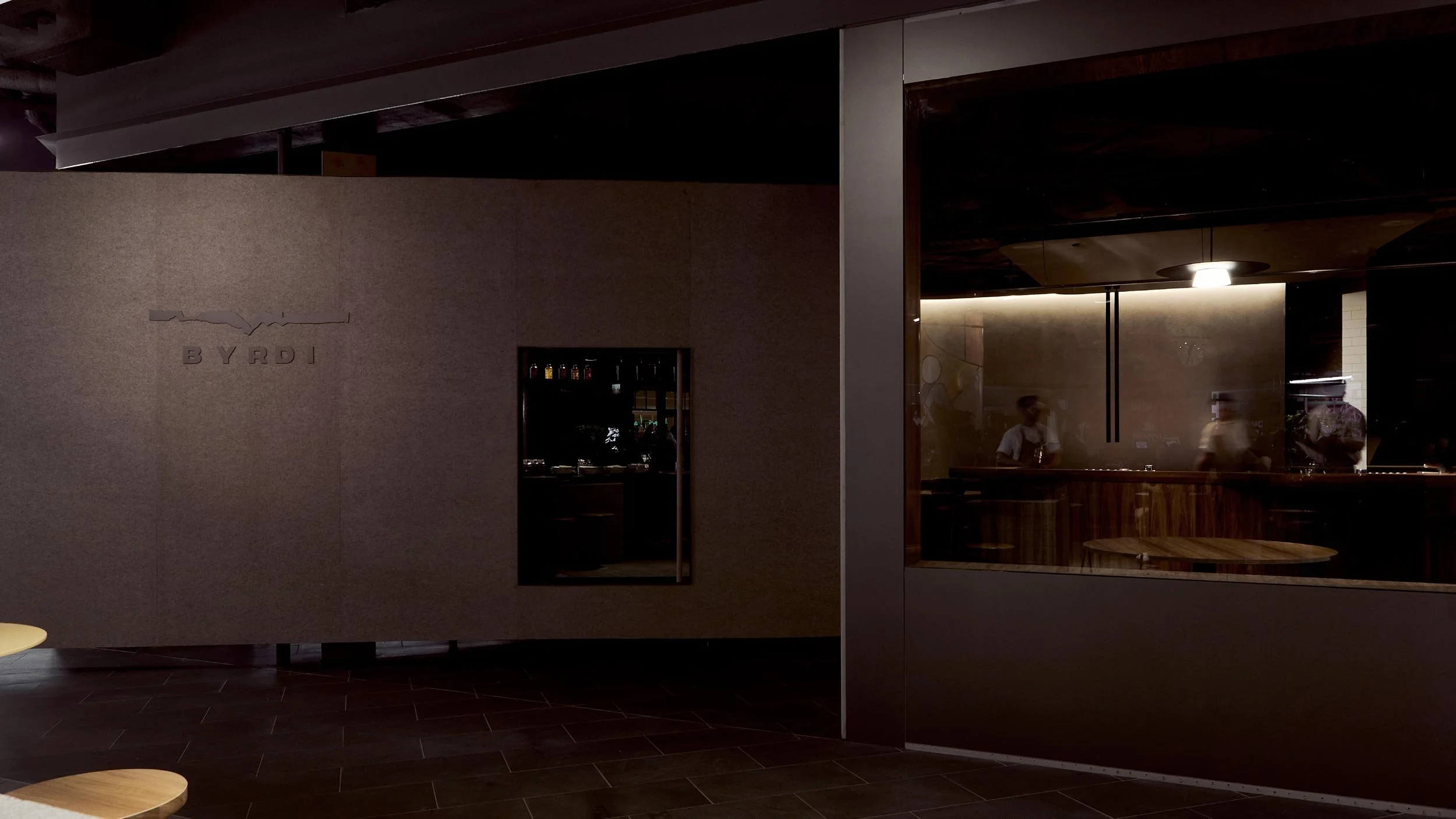
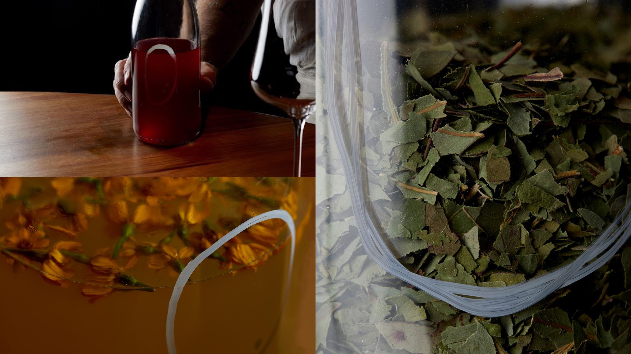
Byrdi is a uniquely Australian bar located in the ELLA precinct of Melbourne Central. The local environment not only informs the drinks at Byrdi but its identity as well. Our brief was to reflect the natural, minimal ethos of its founders, Luke Whearty and Aki Nishikura.
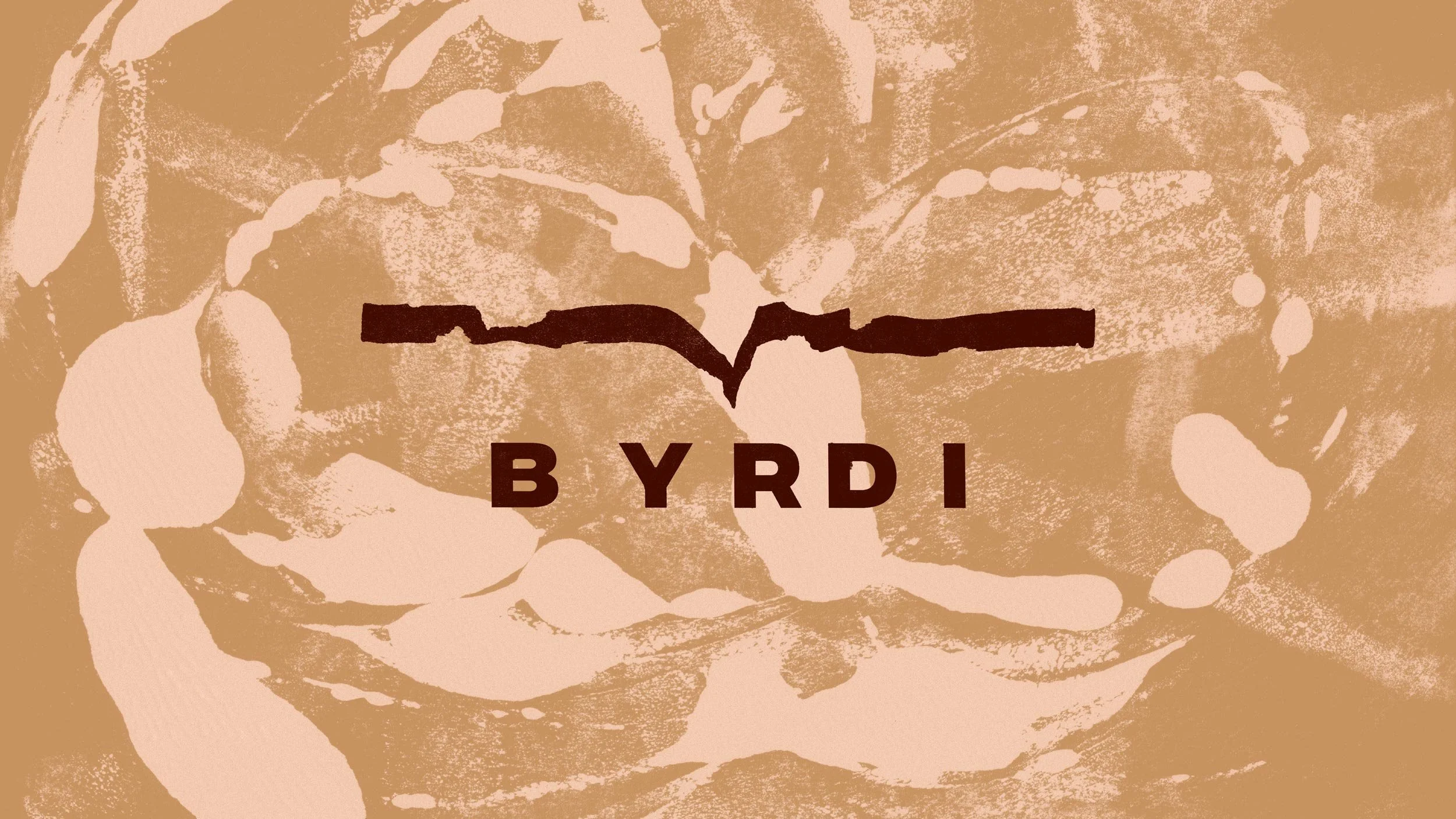
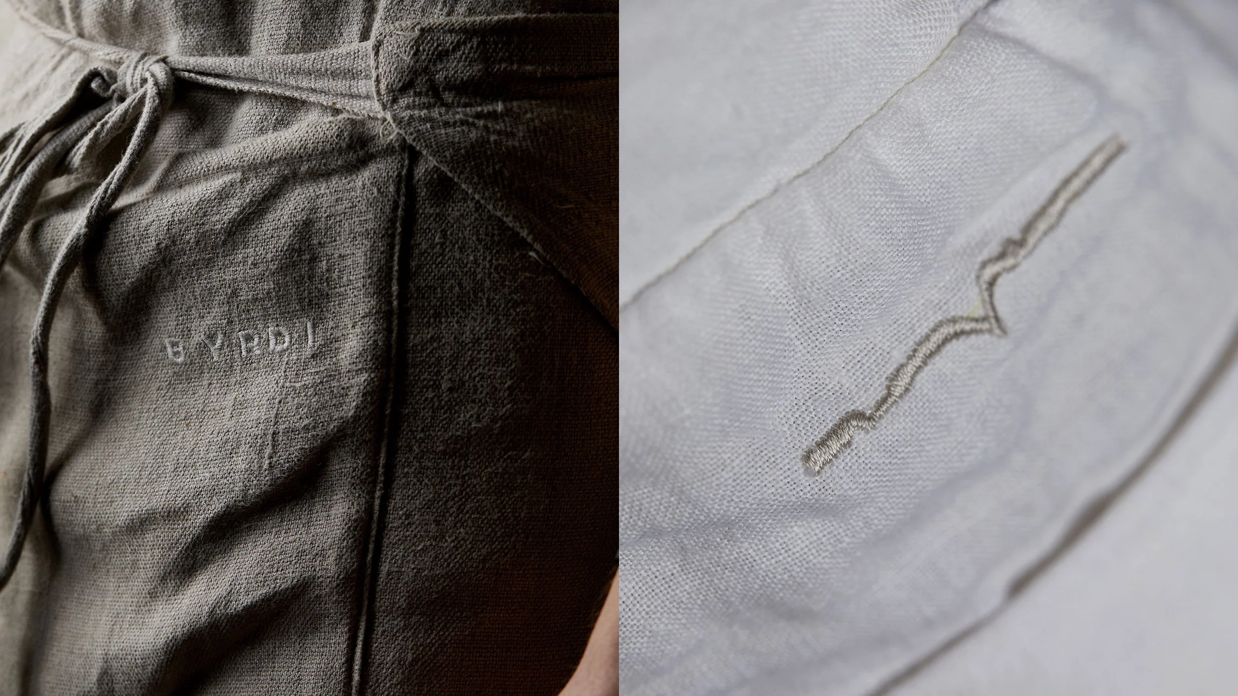
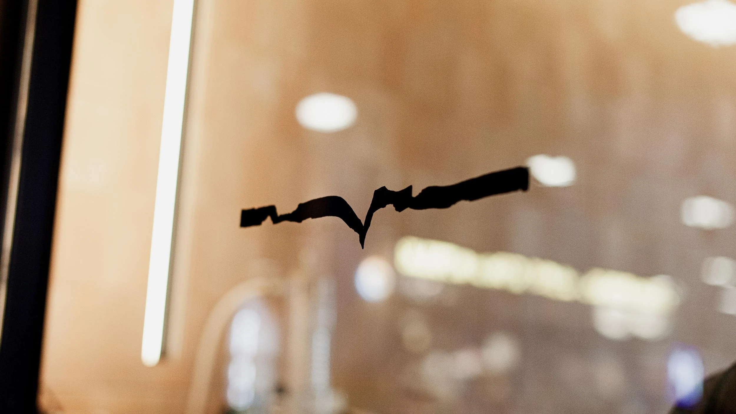
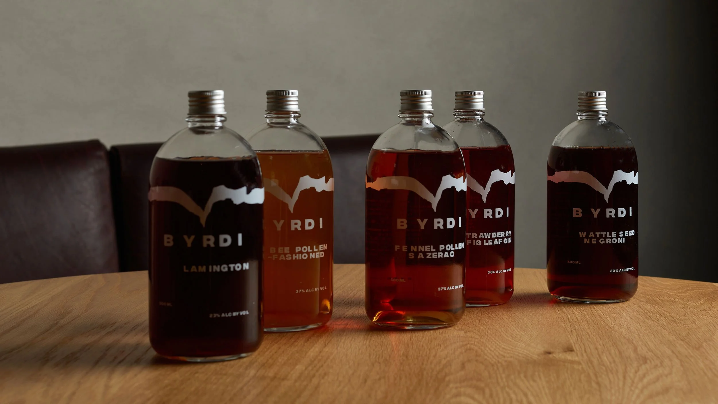
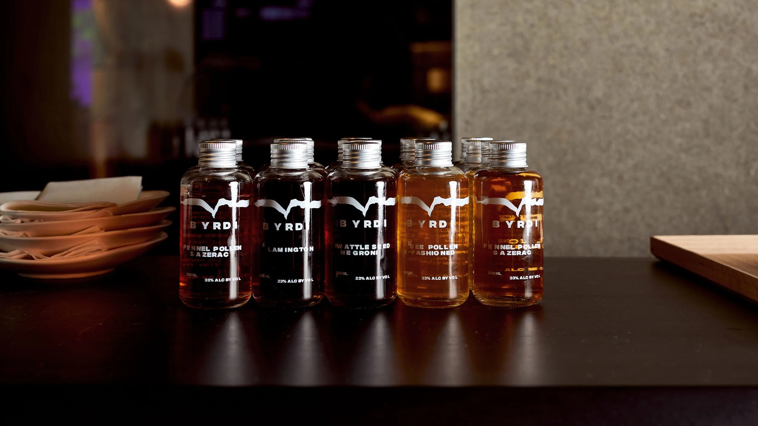
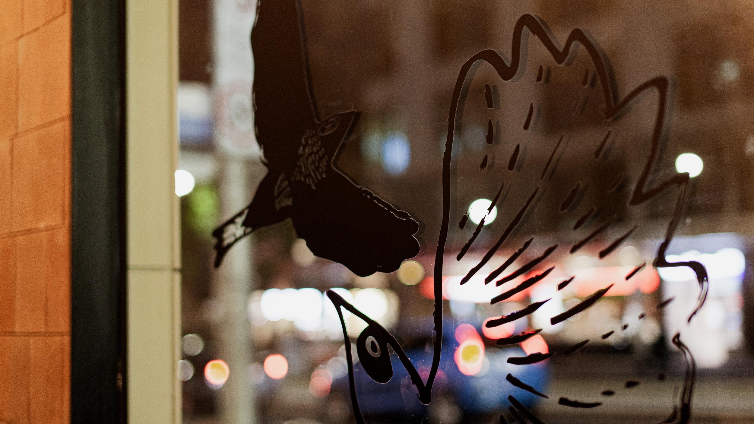
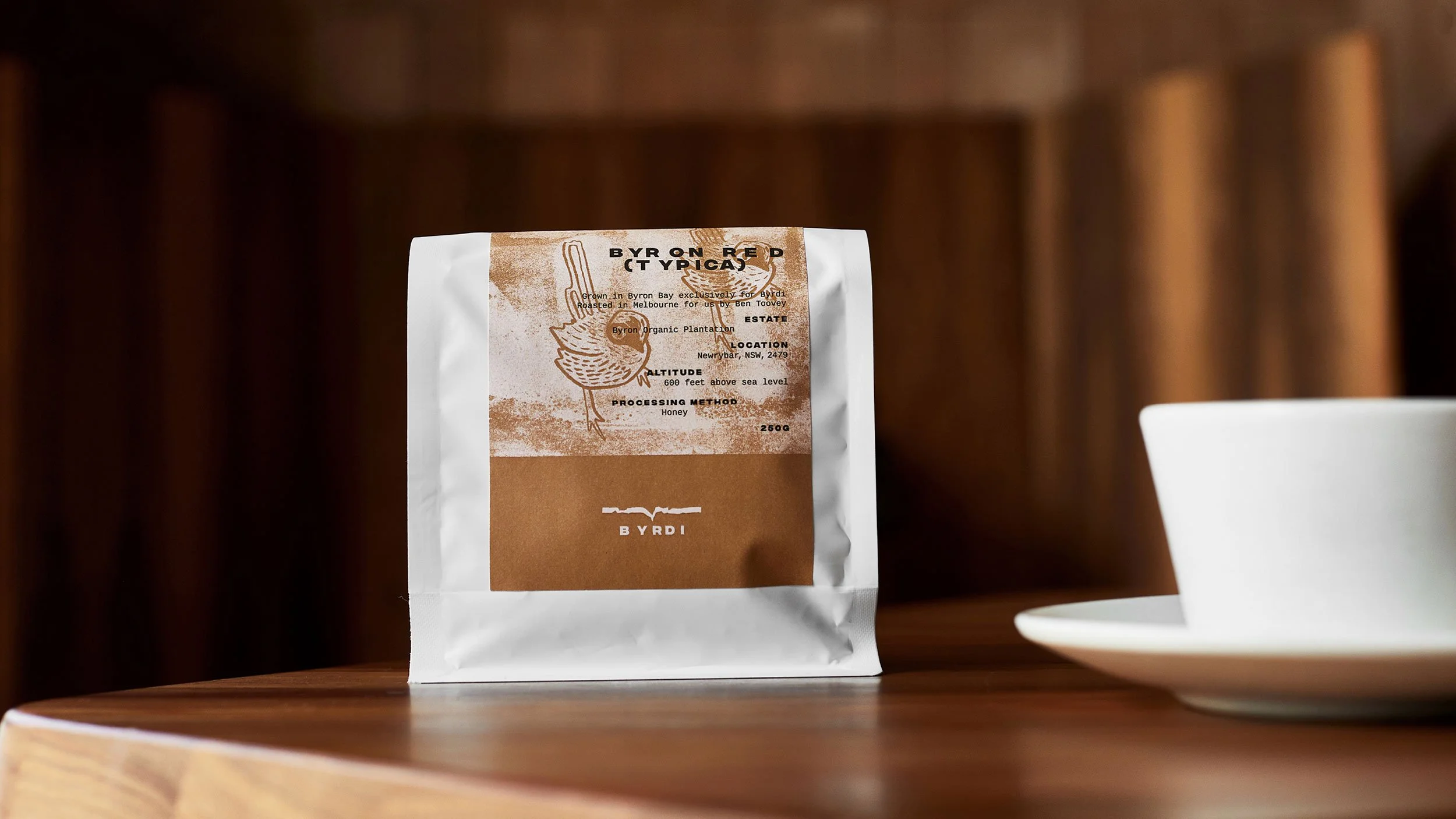
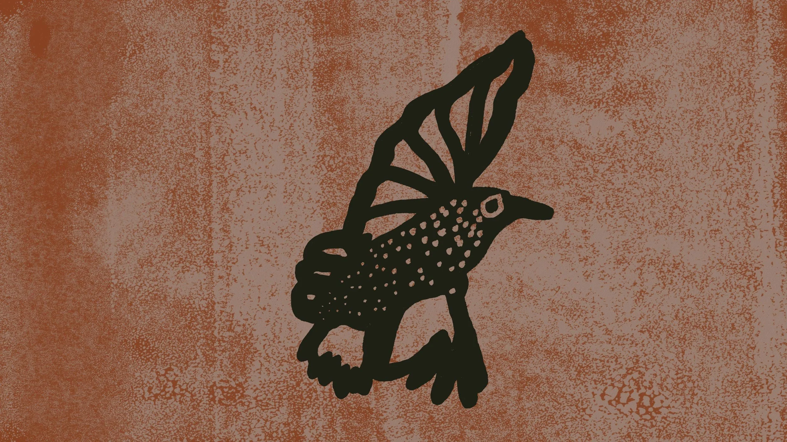
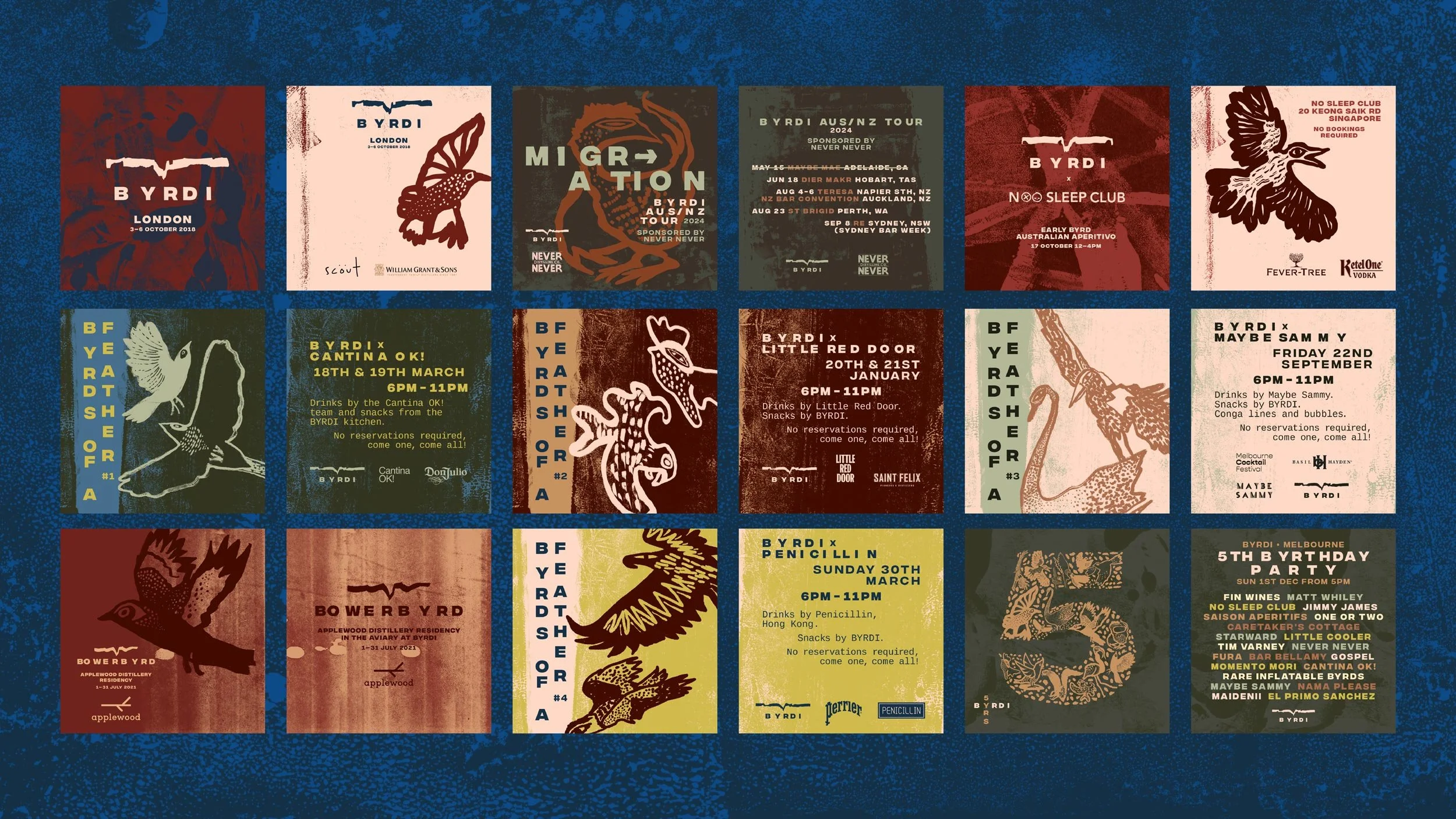
The hand-rendered Byrdi symbol simultaneously references a bird in flight and a cross-section of landscape or sea bed. Typography in the logo (and headings elsewhere) are treated with a wabi-sabi approach; imperfectly spaced like trees in a field.
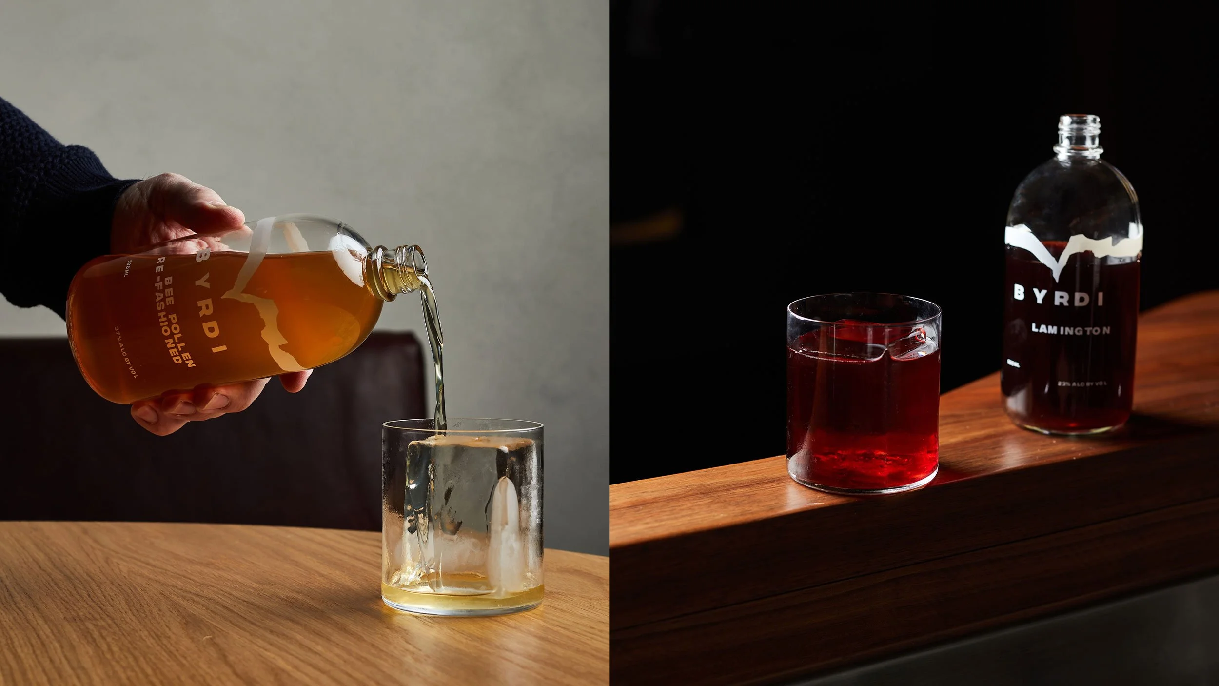
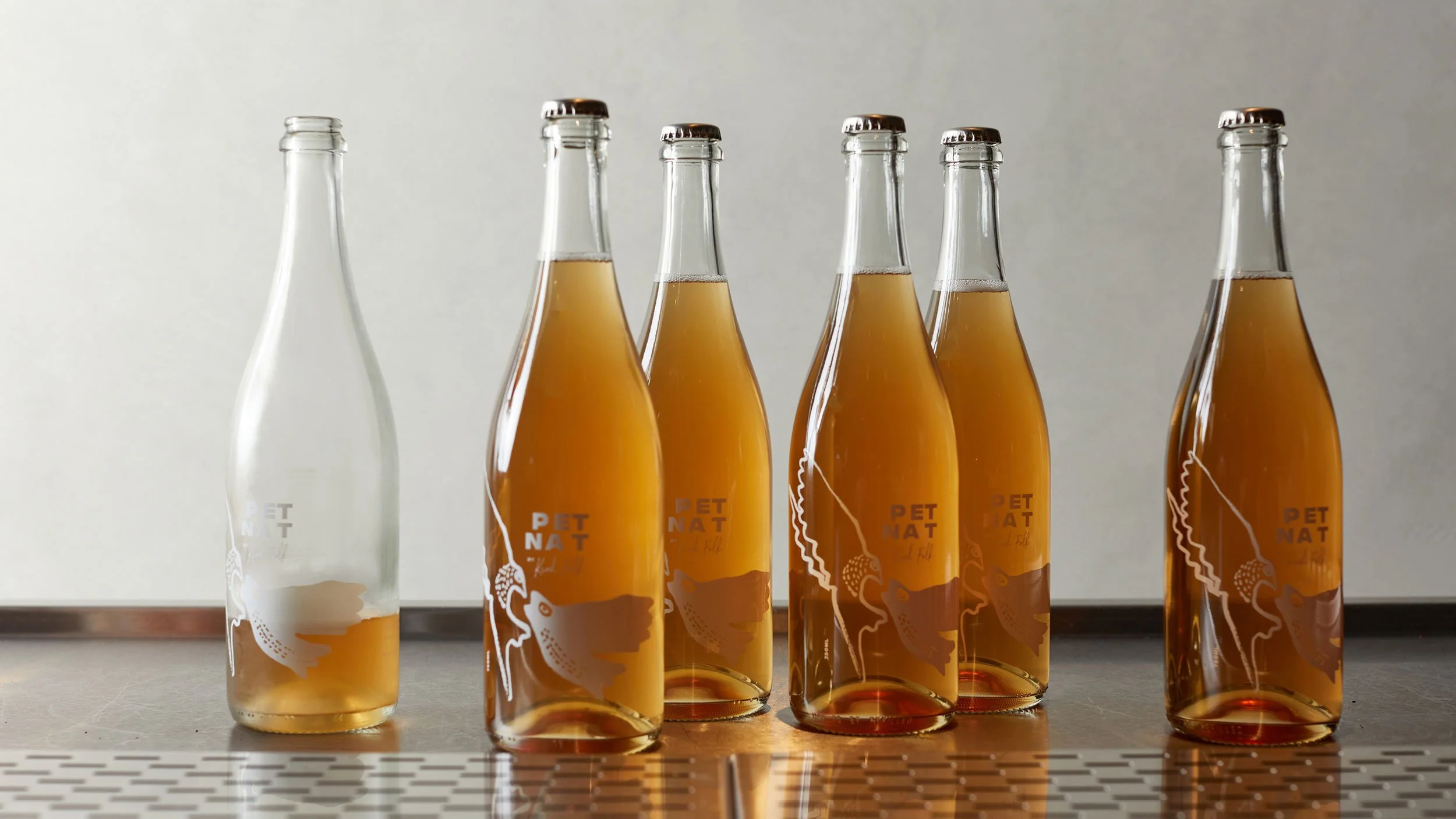
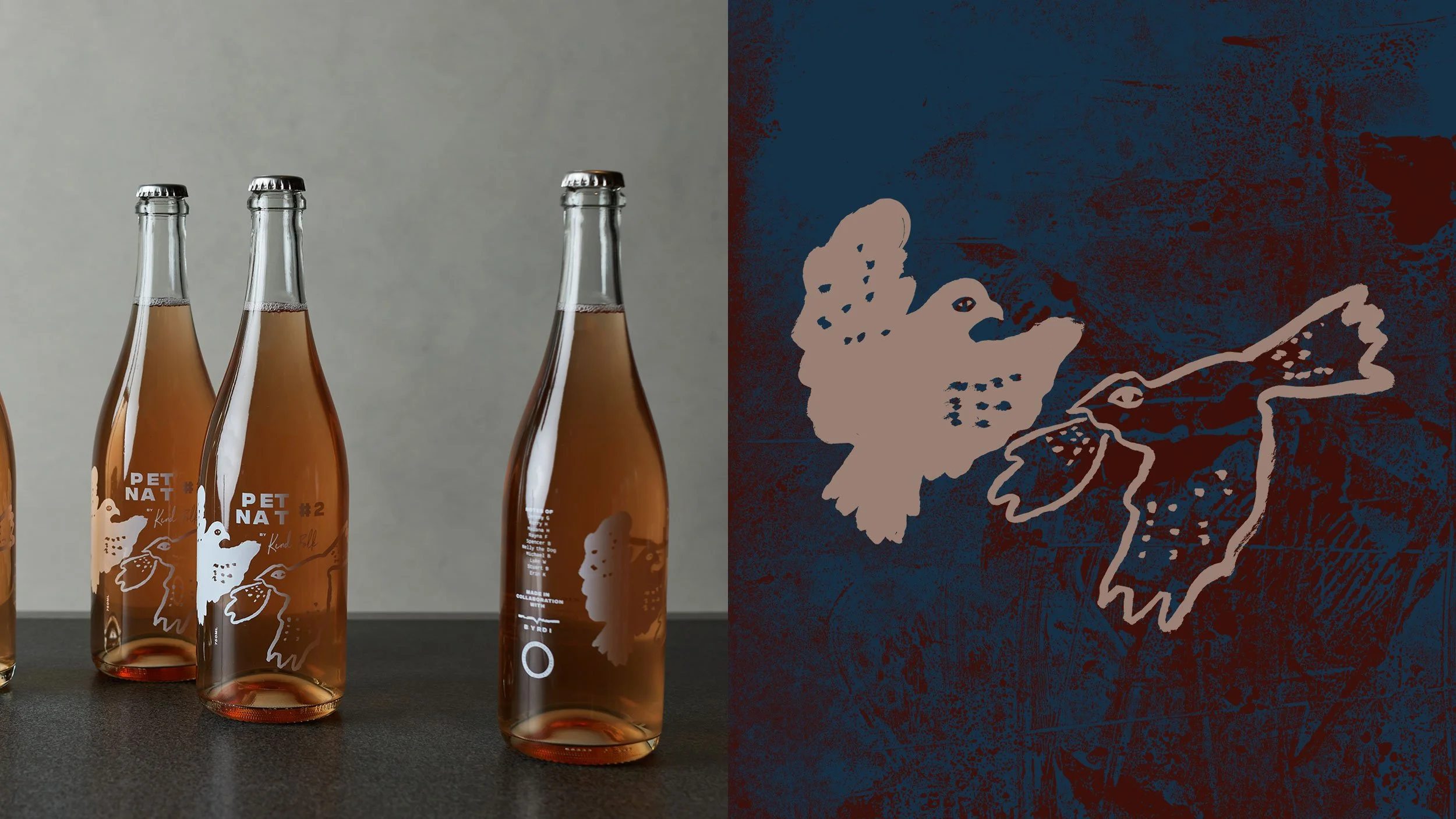
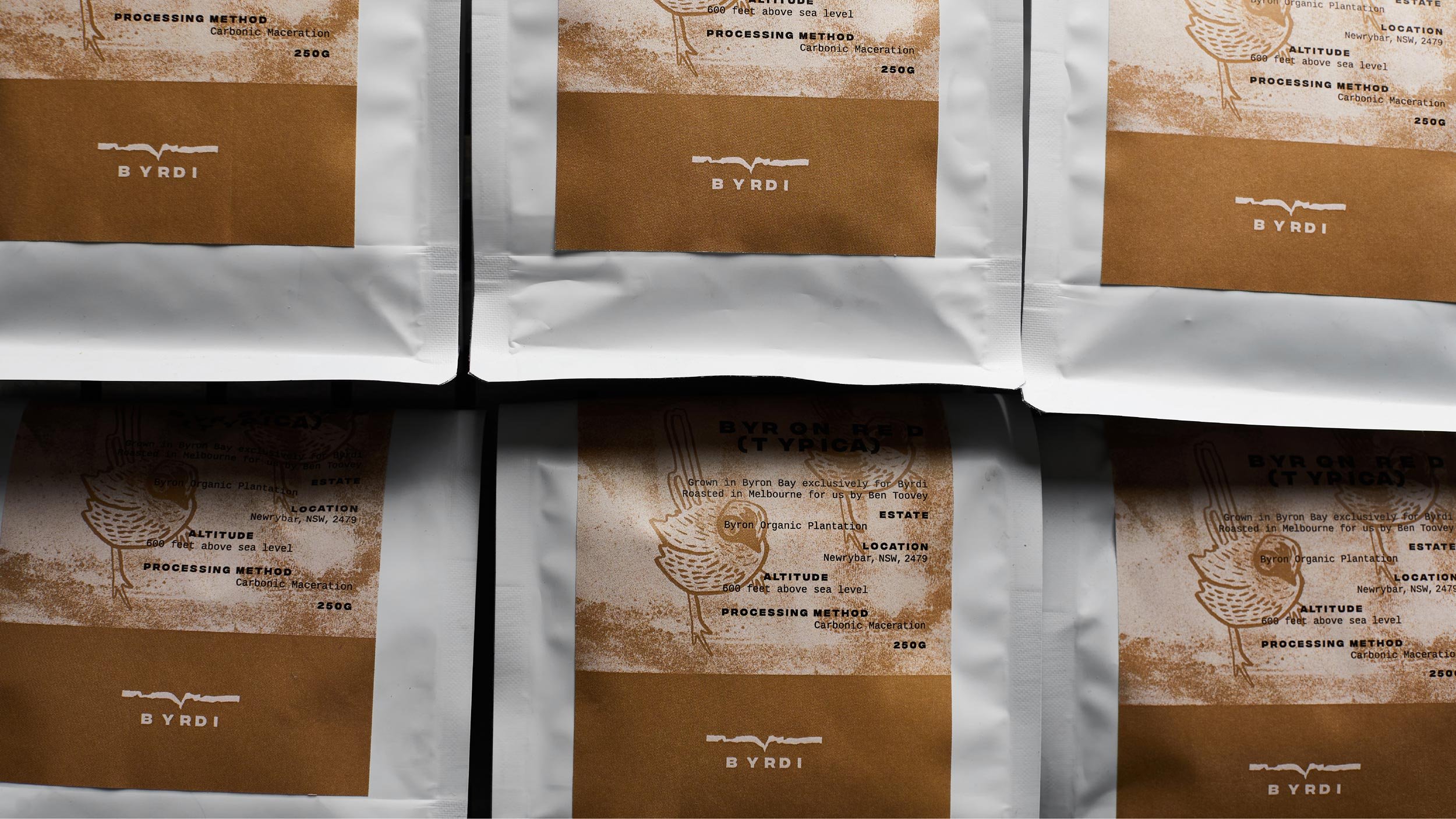
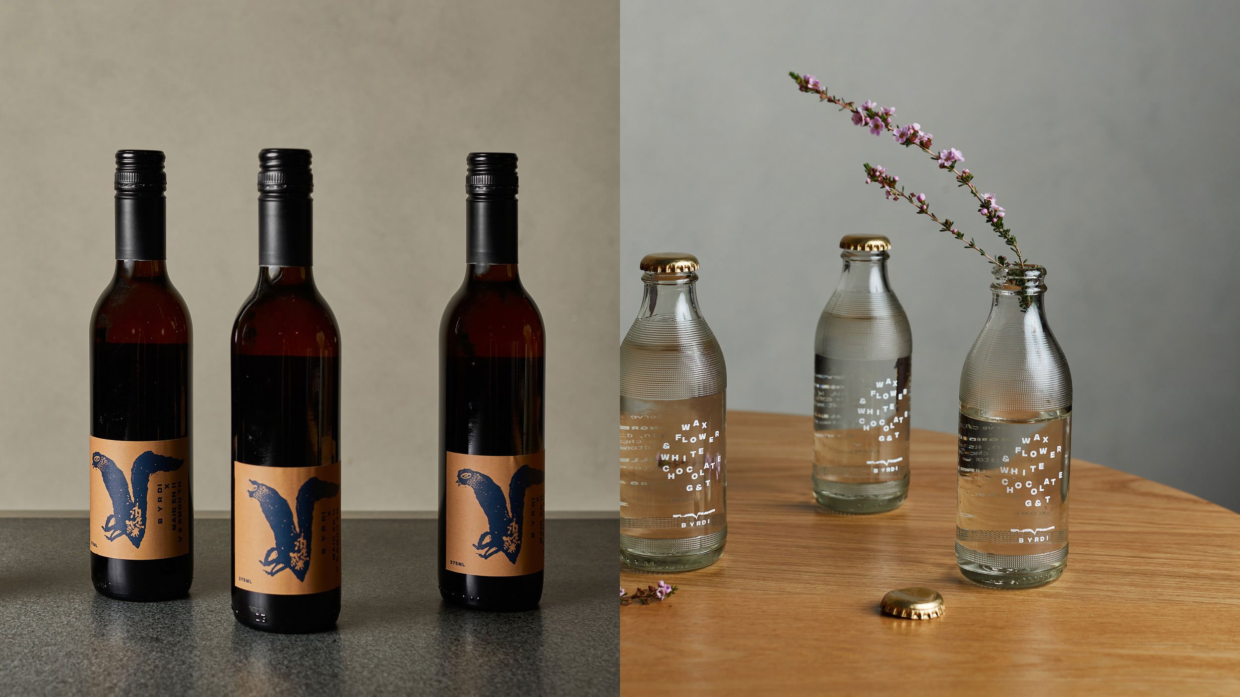
The colour palette is a reflection of the Australian landscape, with soil, sand and sea all represented. Hand printed textures call to mind the natural physical environment.
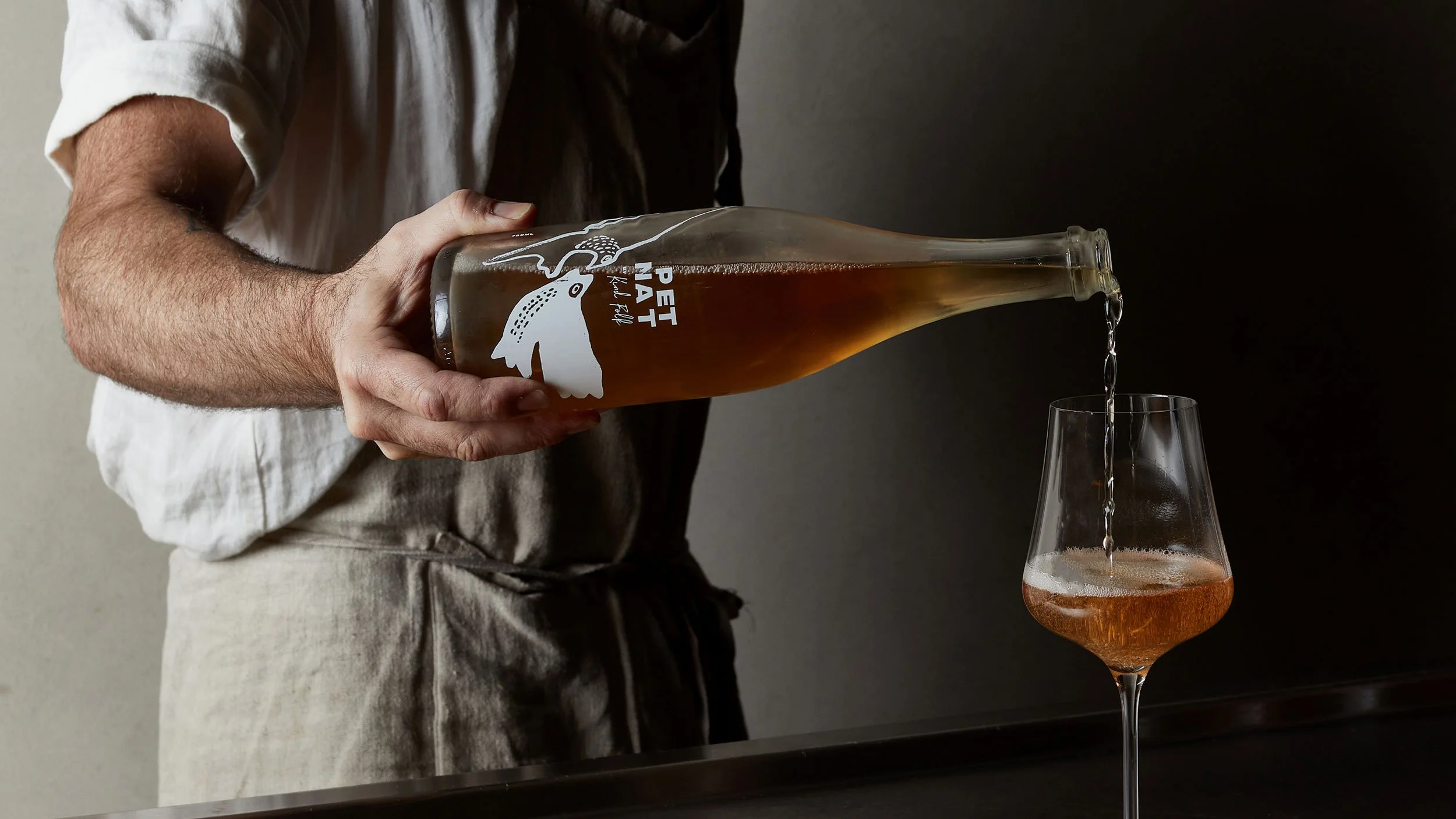
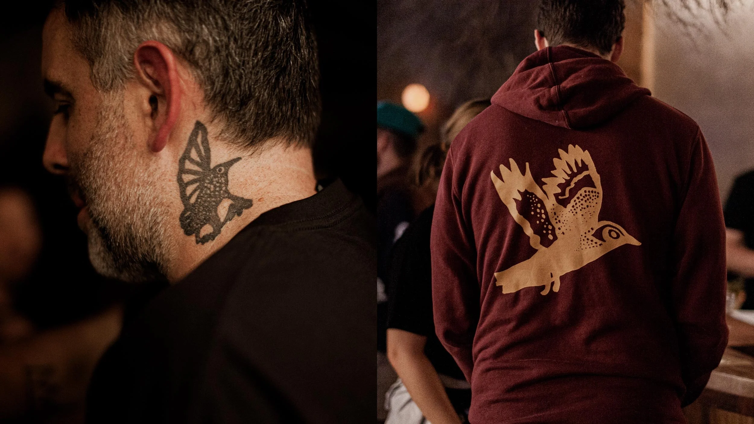
When birds feature in the design – as on the coffee packaging and wine label (and Luke's neck tattoo!) – they are drawn loosely with lines and dots to echo the raw design approach and bring energy to the designs.
Project Credits
Design, Typography & Illustration:
Drooly Noted
Copywriting:
Katie Moore
Photography:
Jana Langhorst
Drooly Noted (Window Decals, Incubation Station, Tattoo/Hoodie)