Client / Overview
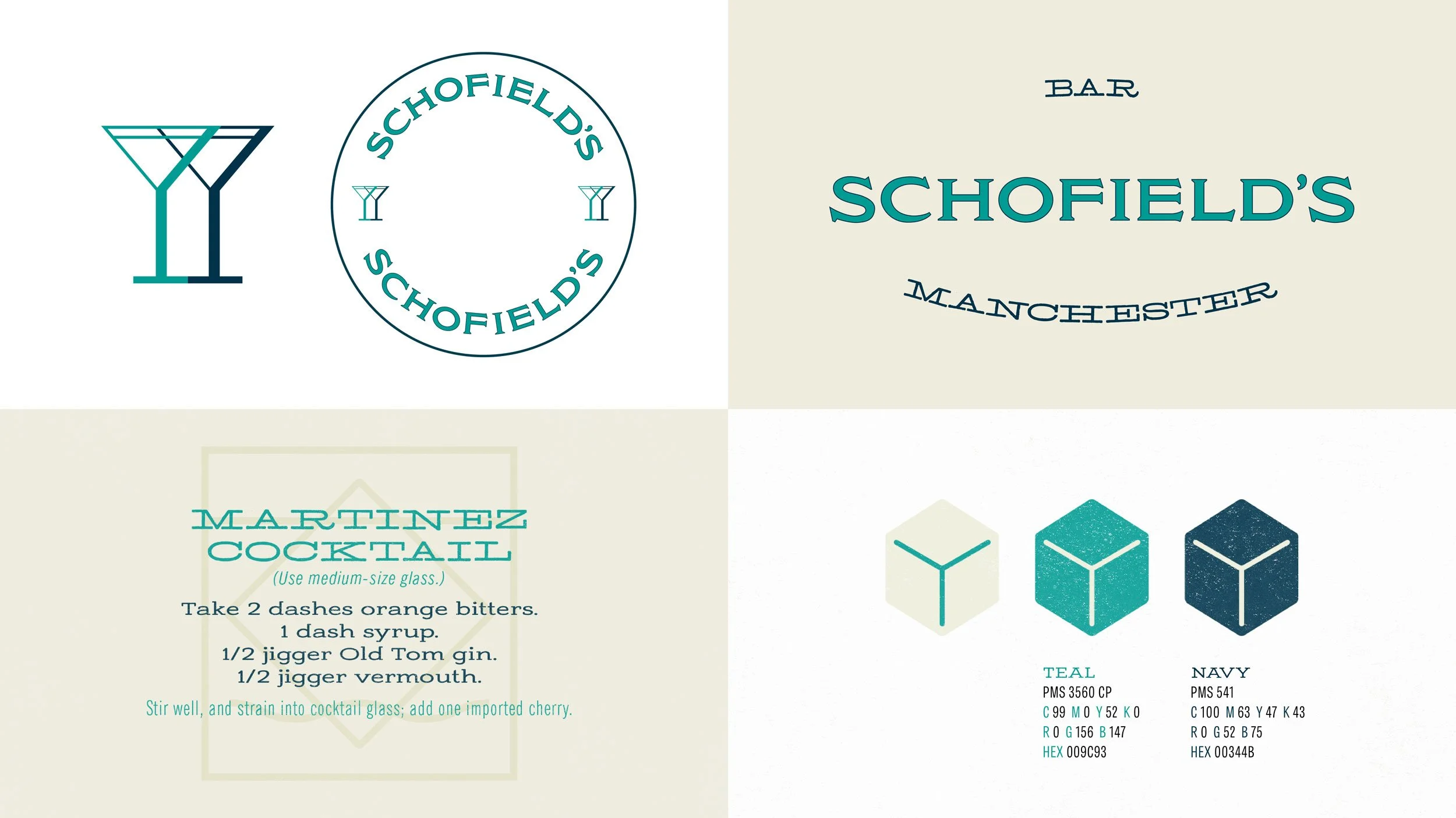
Schofield’s is a classic bar in Manchester, UK that feels like it’s been there forever – a warm, inviting institution by brothers Joe and Daniel Schofield. To reflect this classic feel, we created branding that feels timeless. A 100-year-old business card belonging to the Schofield’s grandfather provided a starting point for the Schofield’s branding, giving the brand a unique heritage story.
We created a straight and curved version of the Schofield’s logo in a teal and navy colour way.
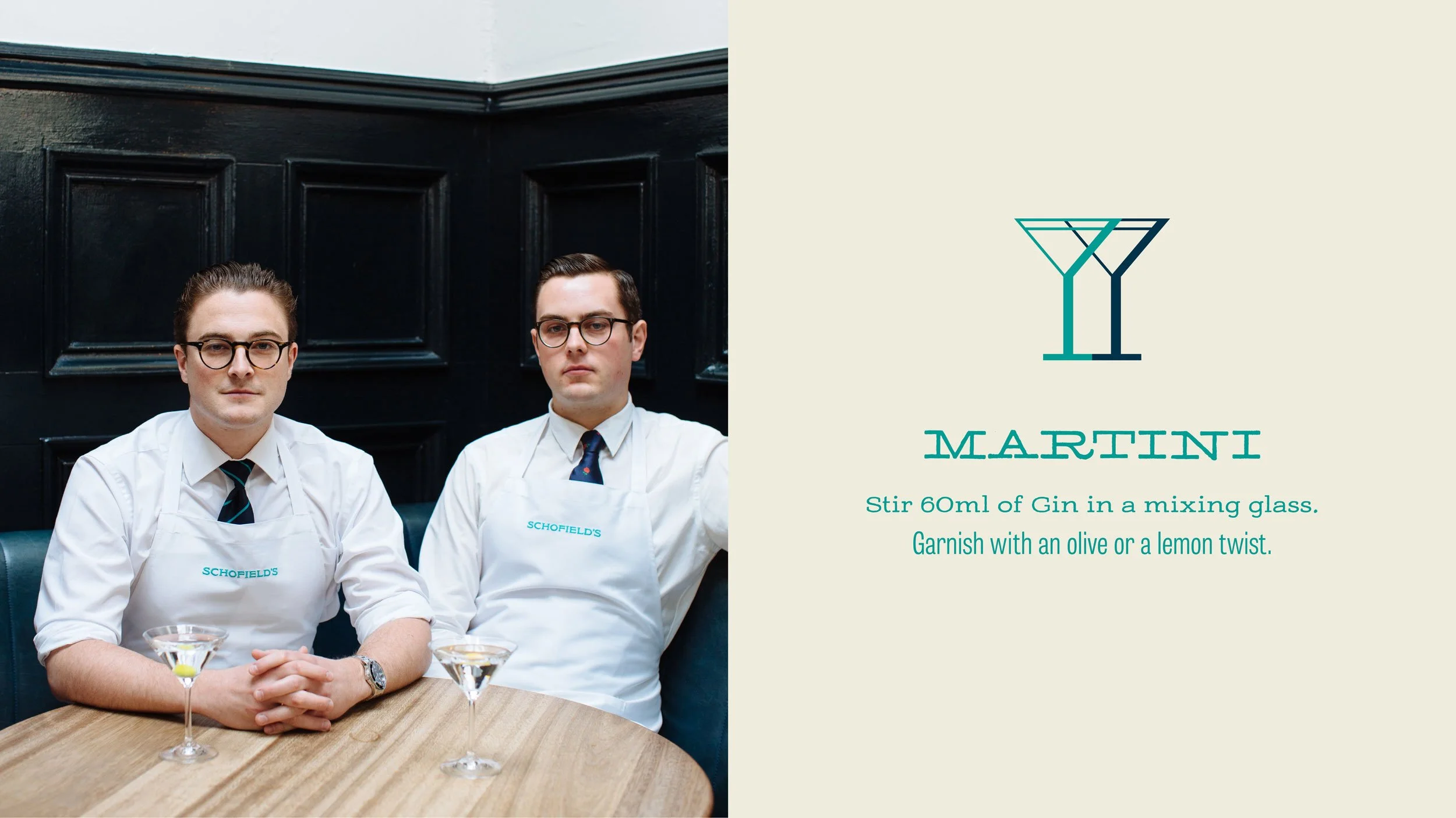
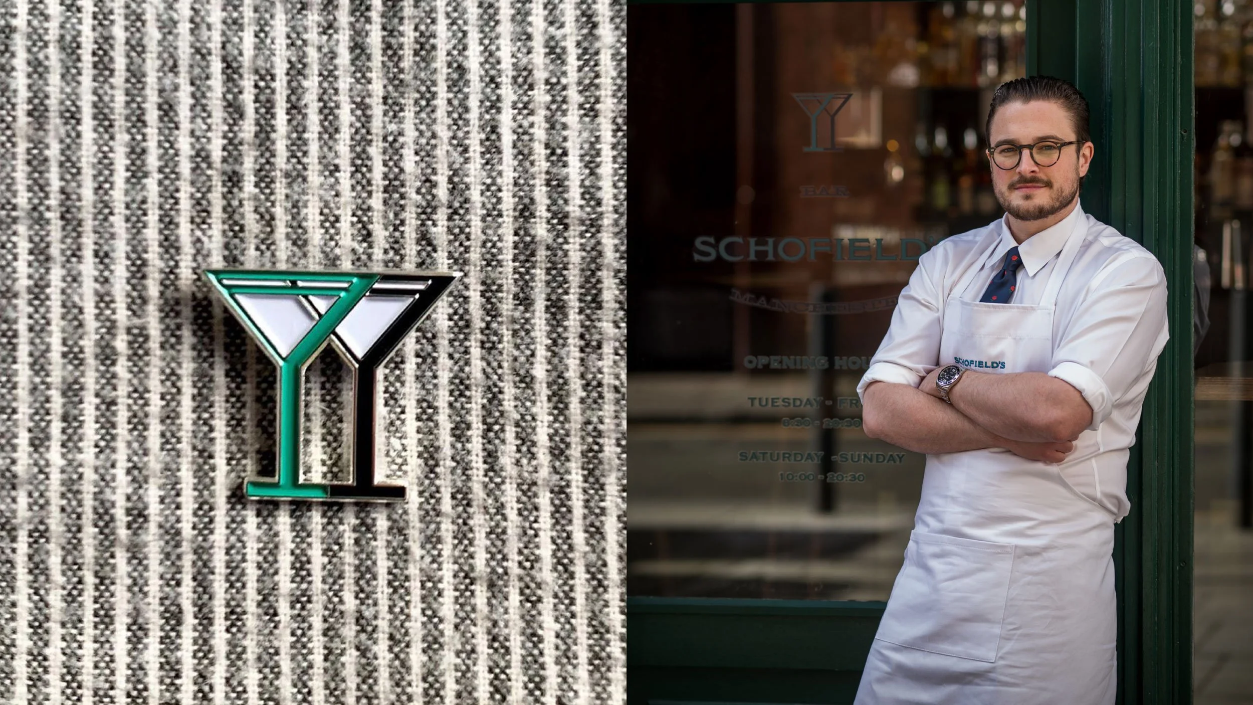
A double martini glass symbol represents the two Schofield brothers coming together.
Project Credits
Design & Typography:
Drooly Noted
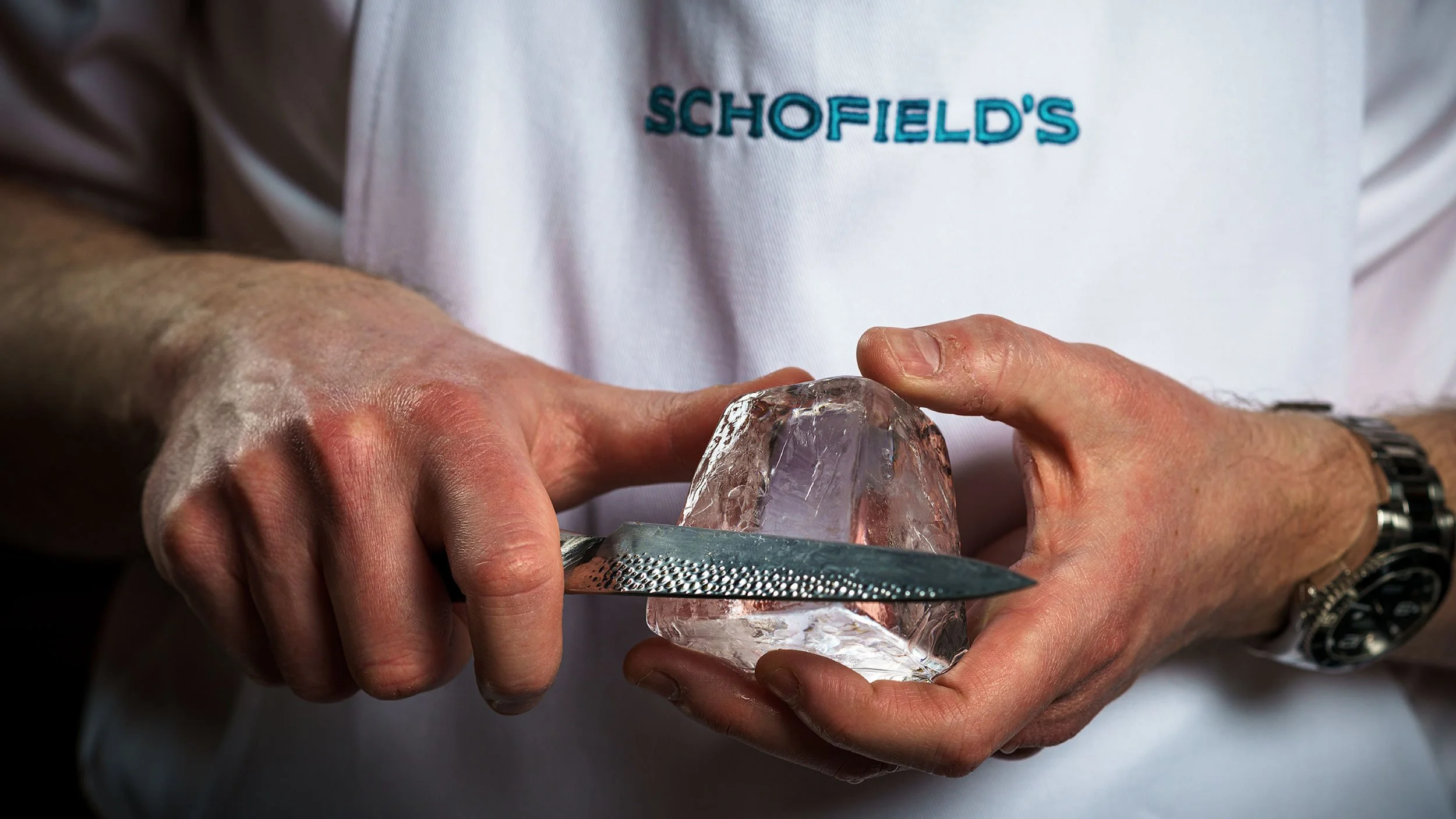
Photography:
Courtesy of Schofield’s