Client / Overview

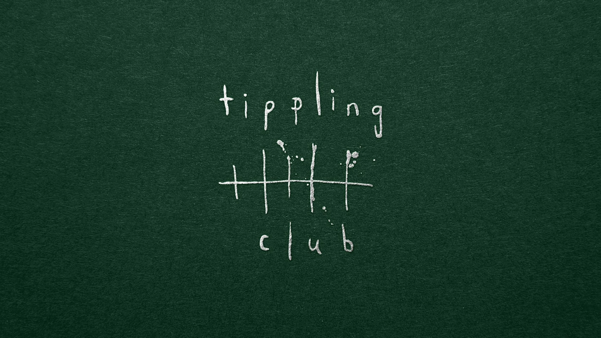
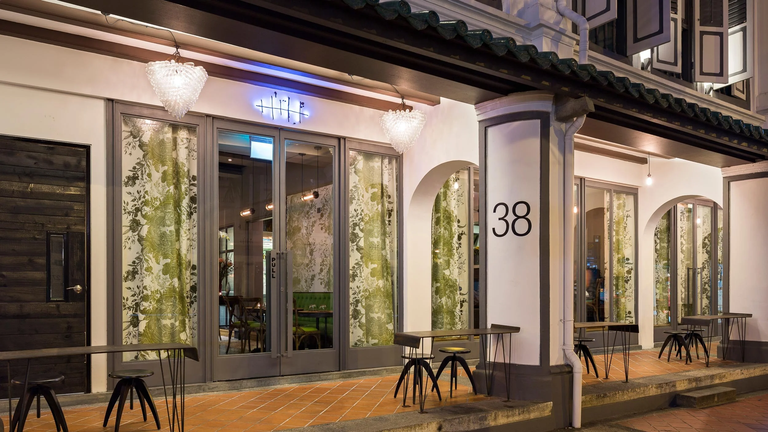
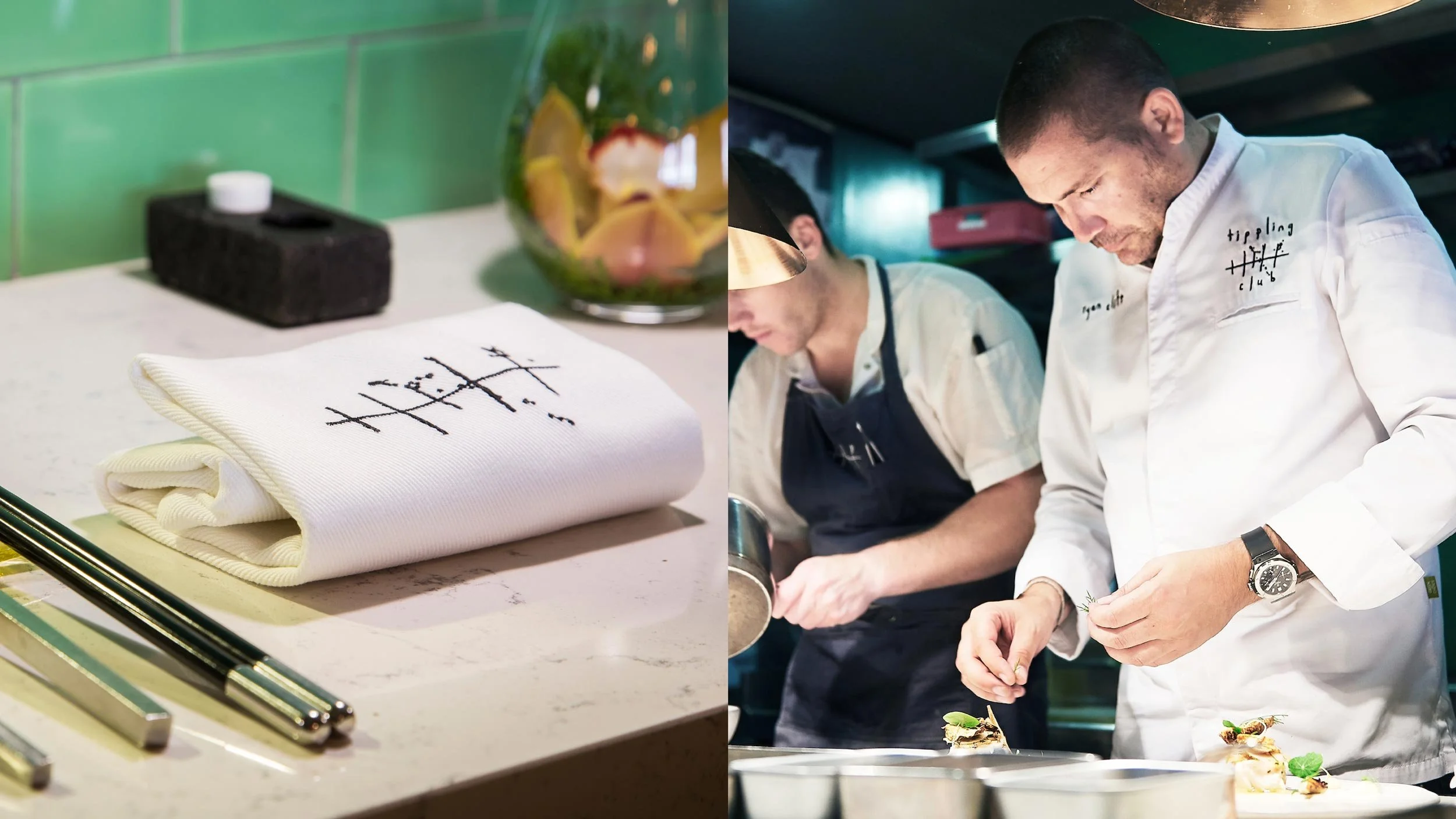
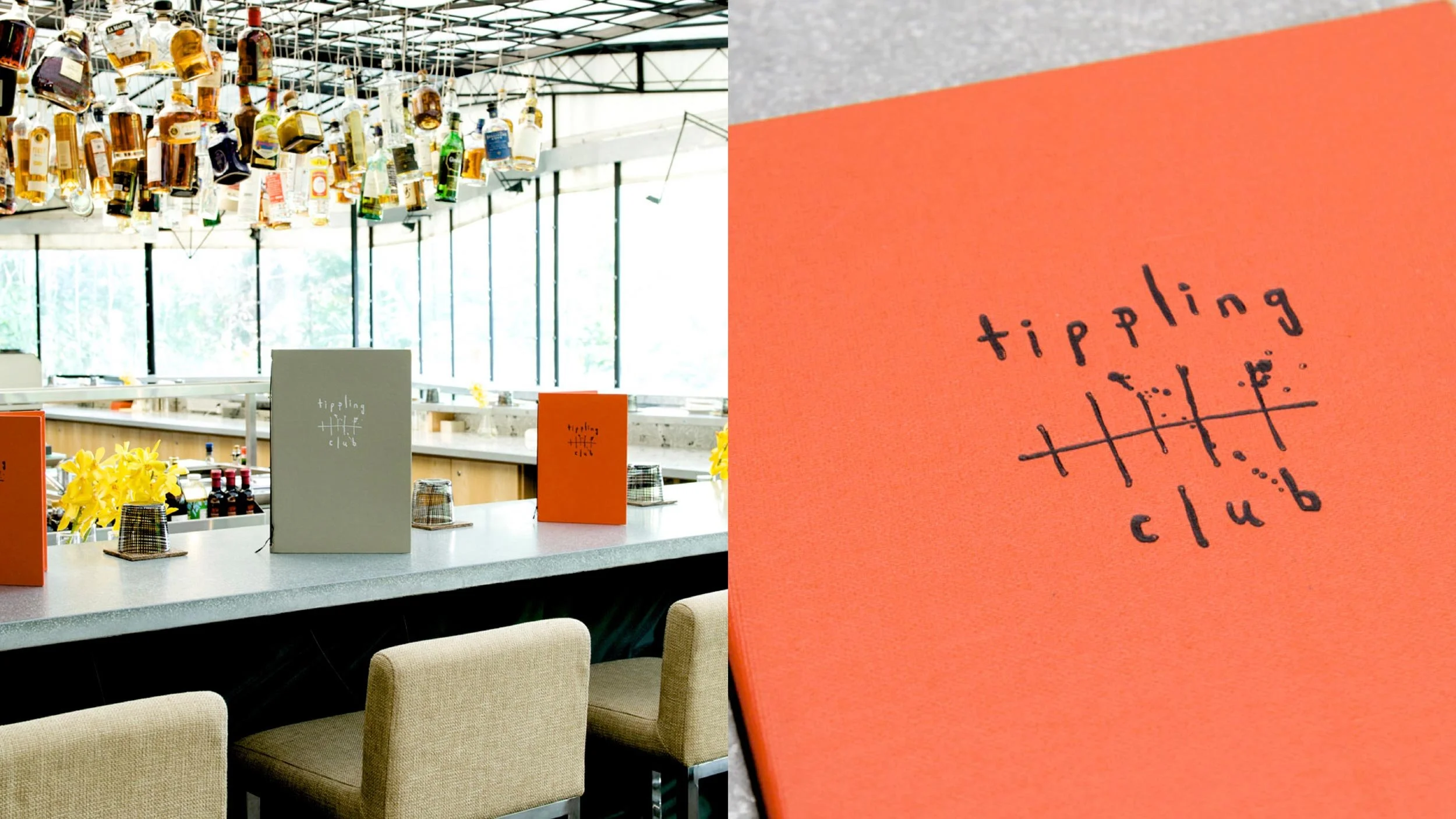
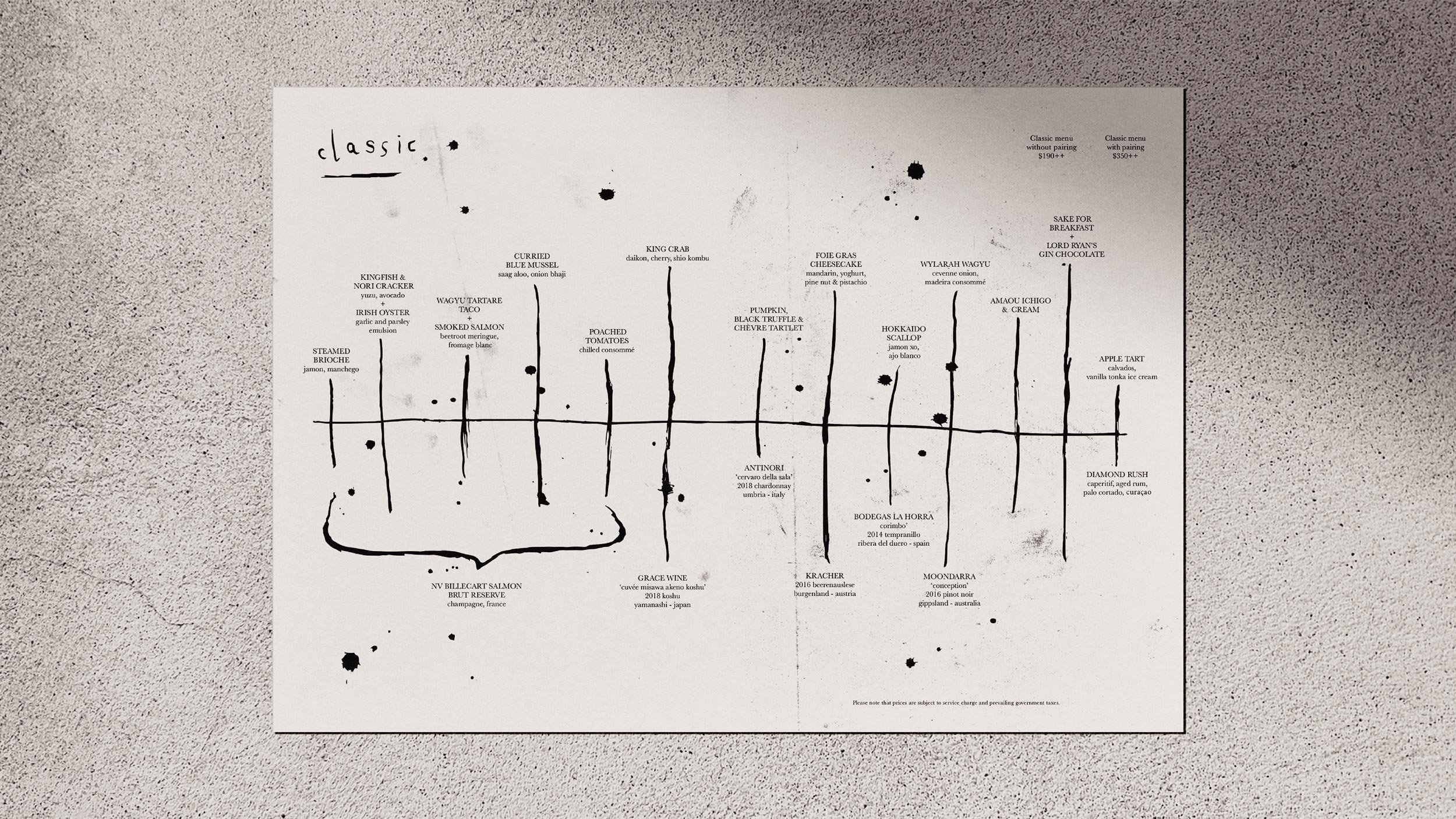
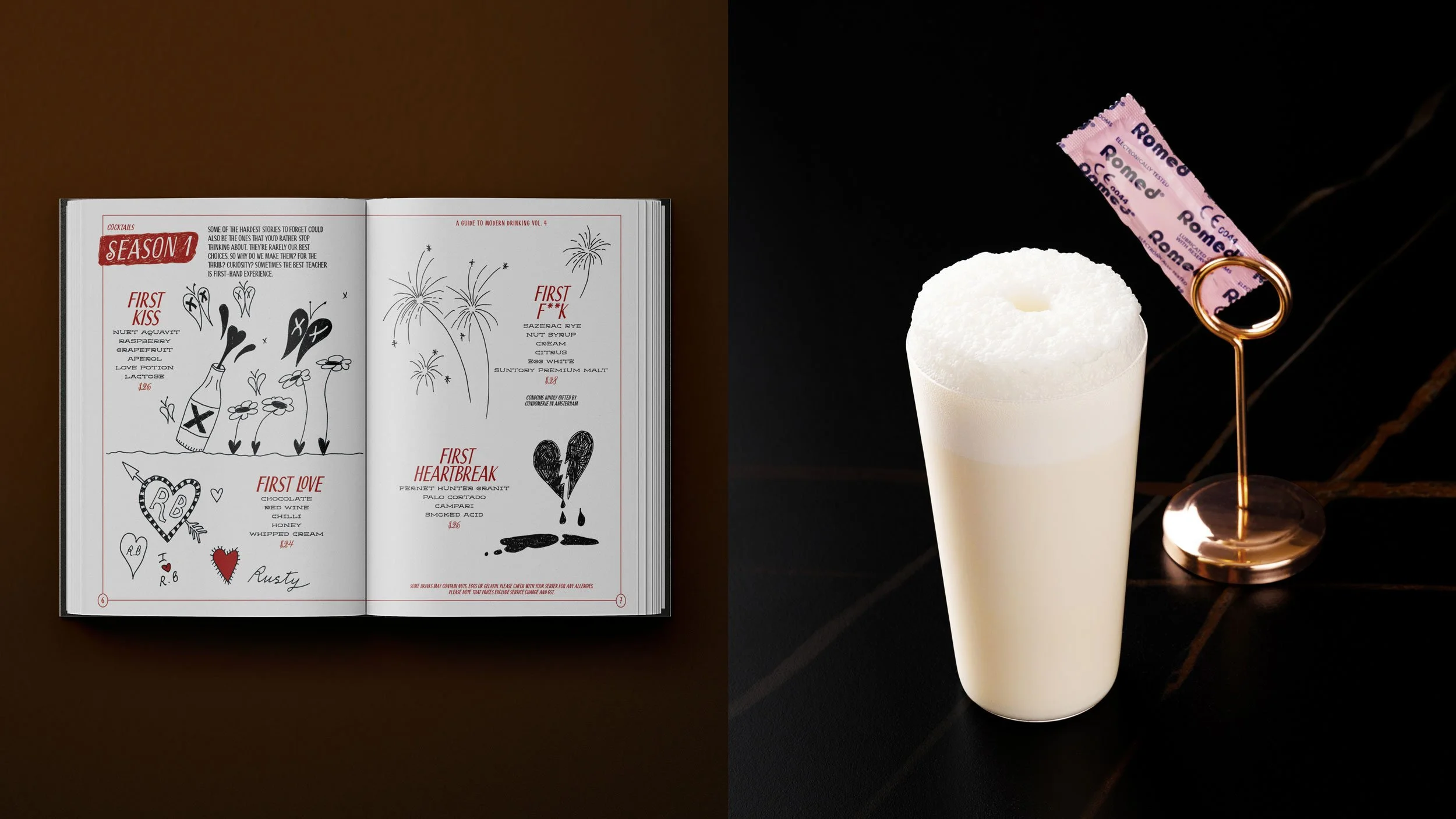
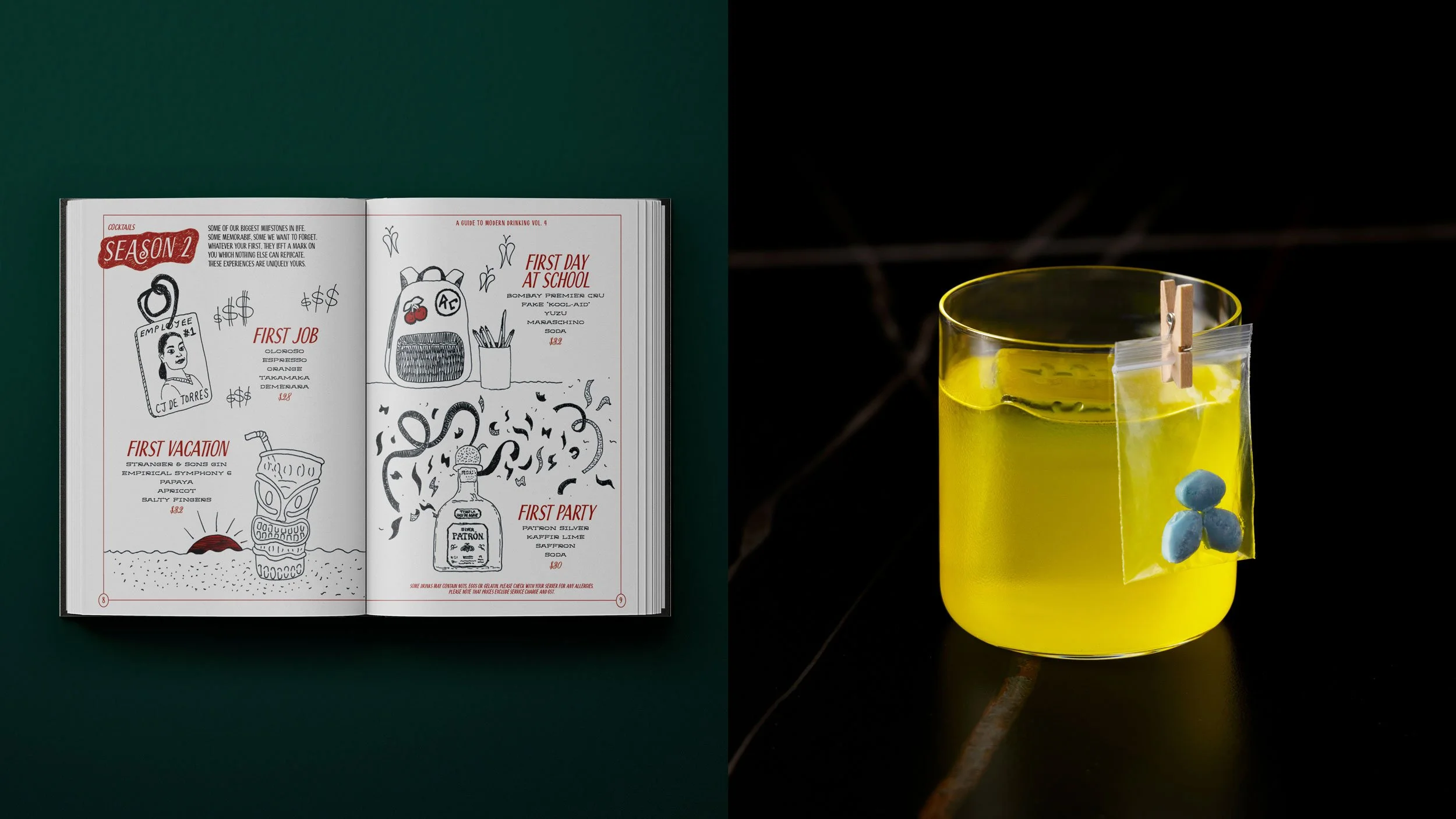
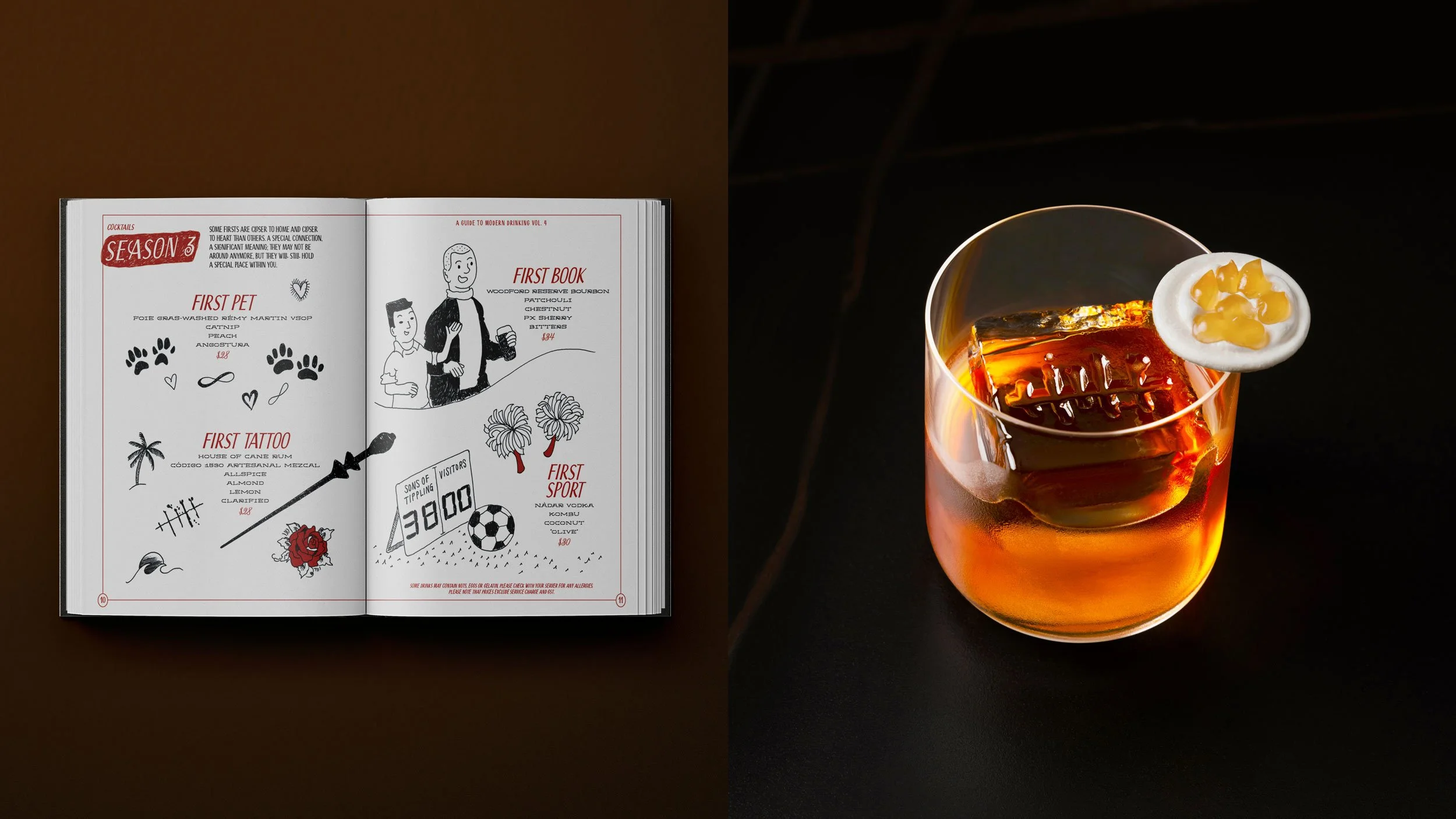
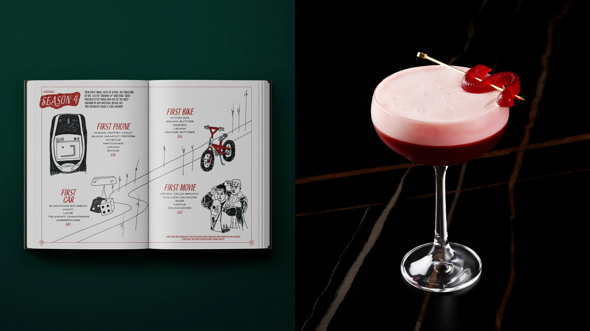
We worked with Tippling Club, a boundary-pushing gastro-cocktail destination in Singapore, from their establishment in 2008 until they closed in 2024. The original owners, Chef Ryan Clift and Matt Bax, reached out with a sketch of a ‘fishbone’ that needed our refinement. It works as a stand-alone symbol but, in practice, serves as a visual structure for food and drink pairings.

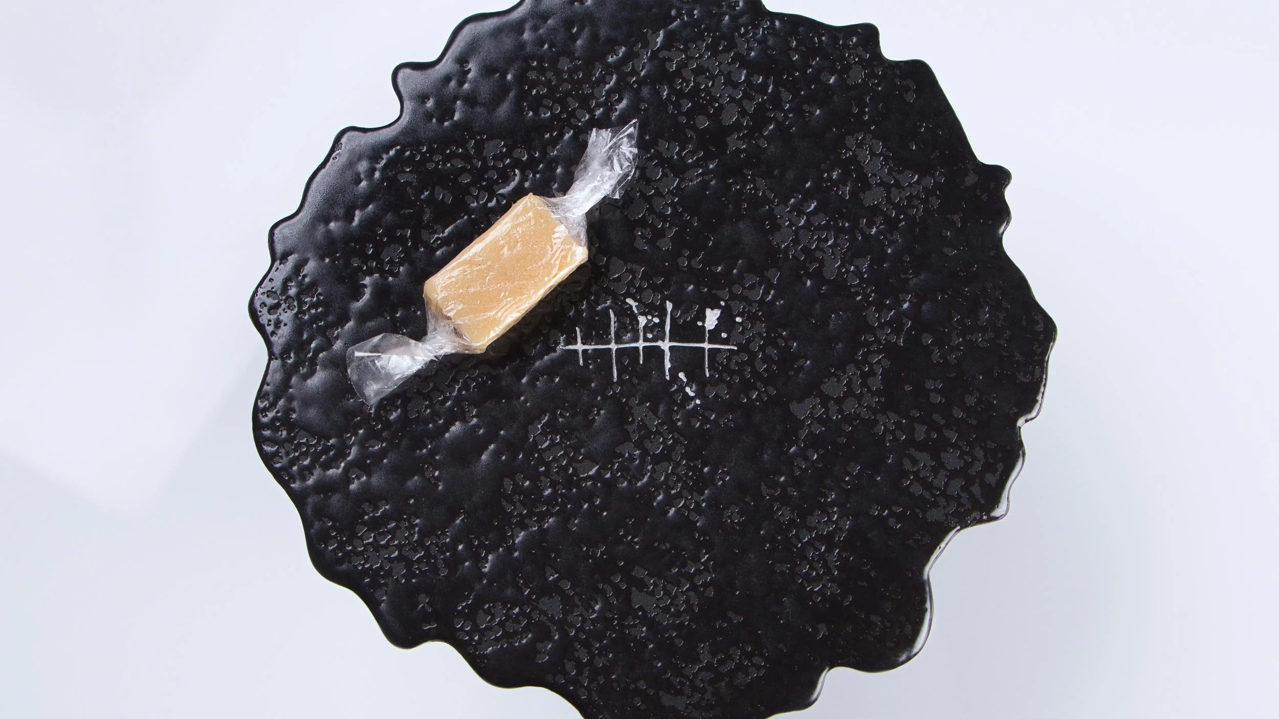
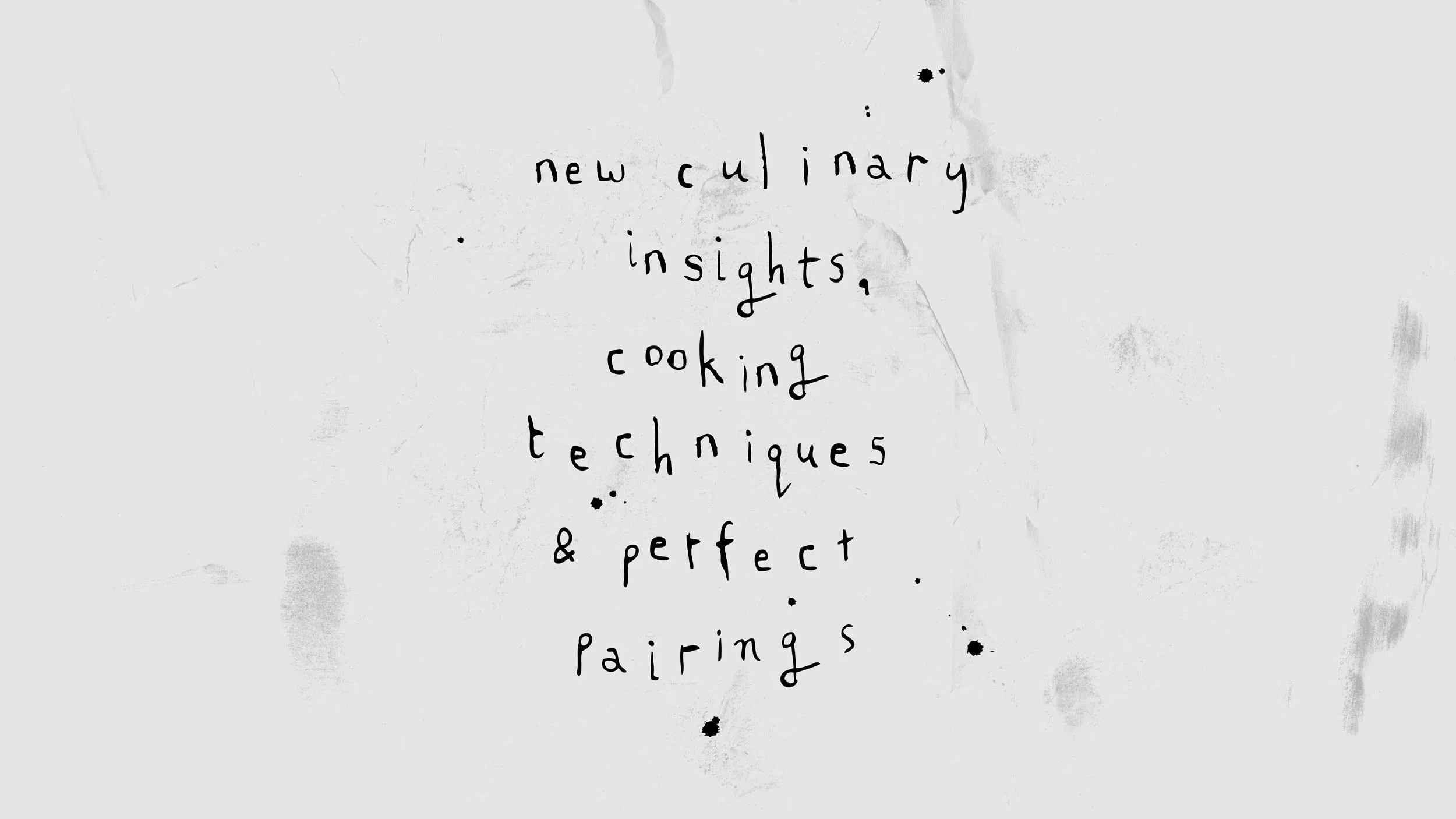
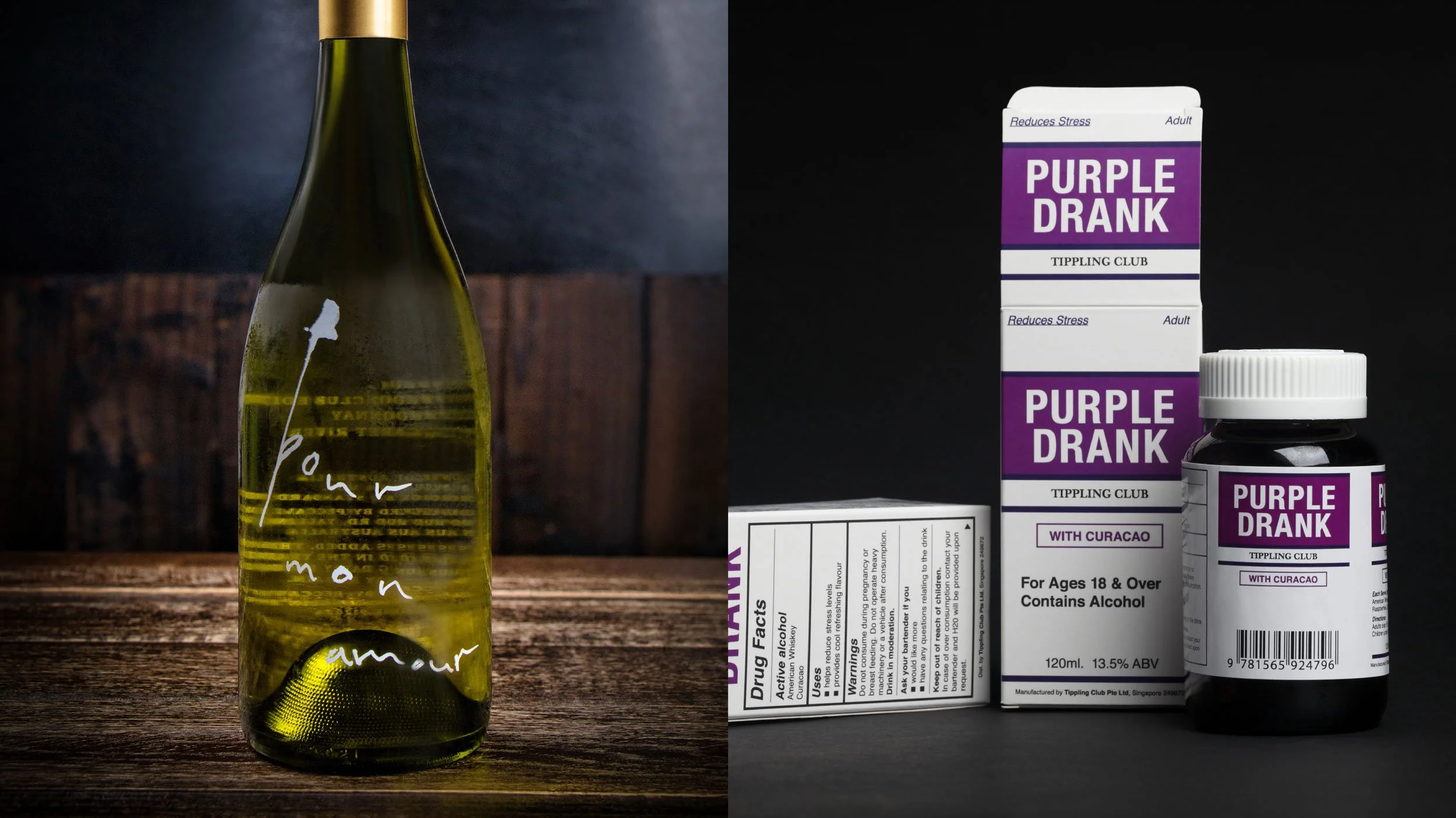
Hand-drawn typography and ink splats in the identity reflect the business's playful, fresh personality.

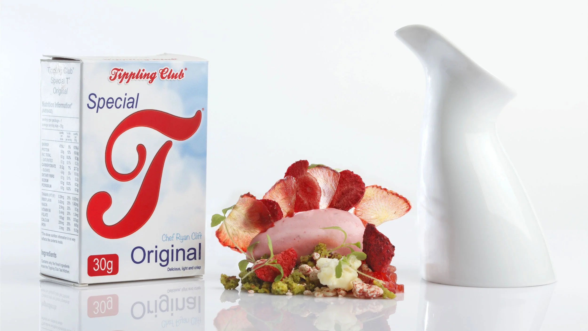
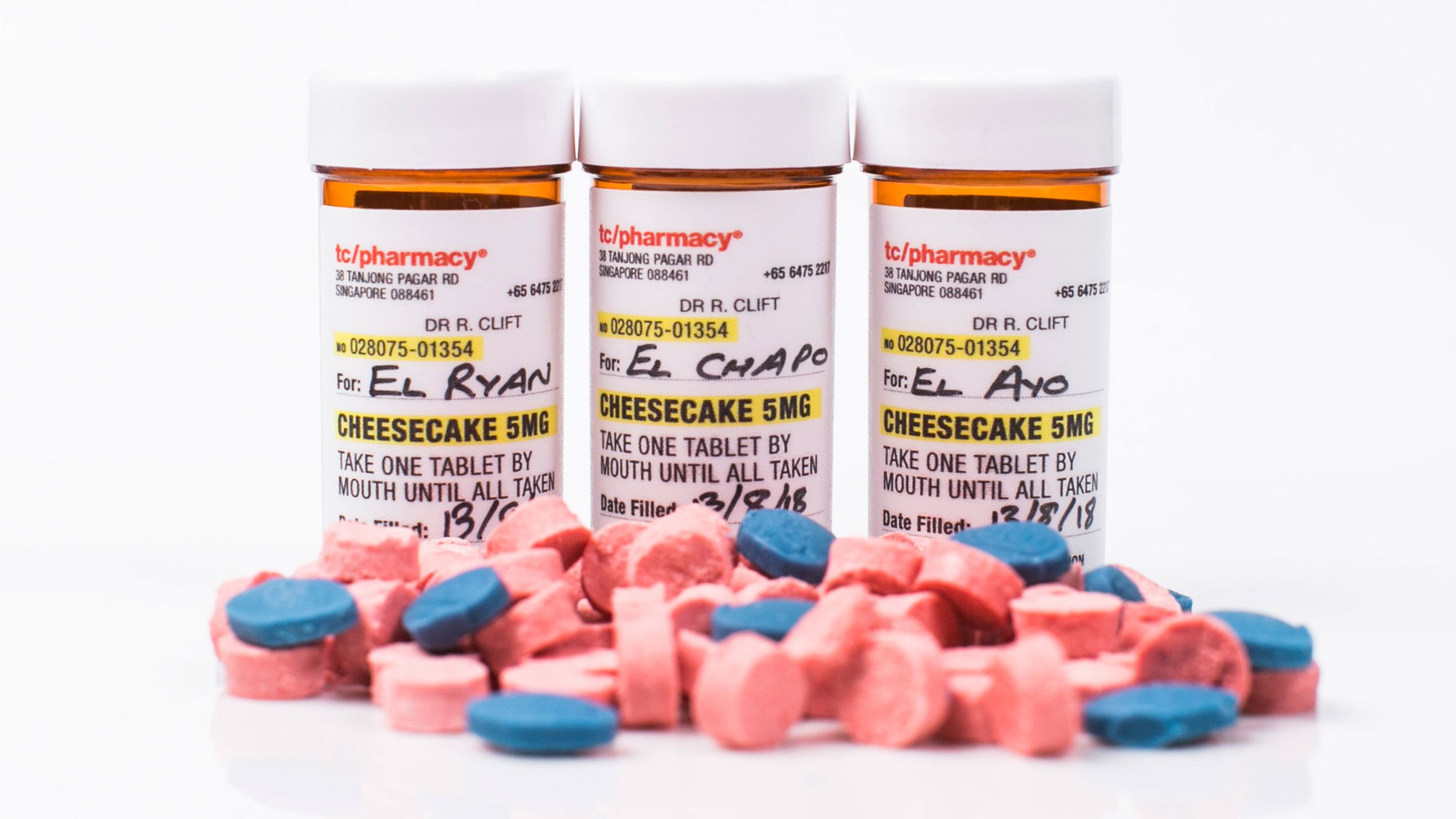
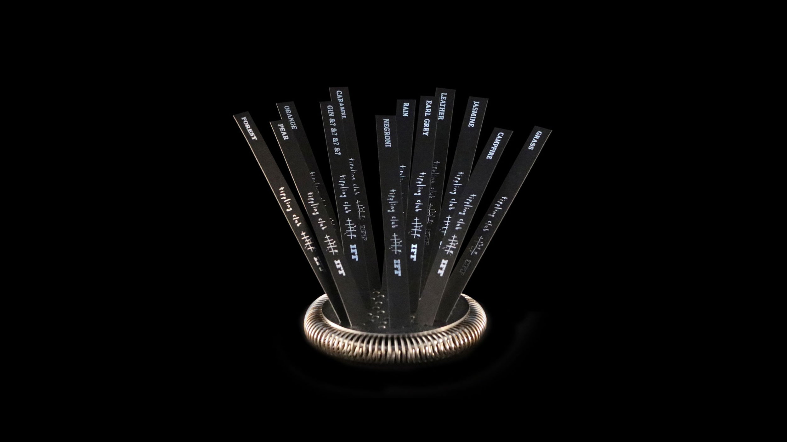
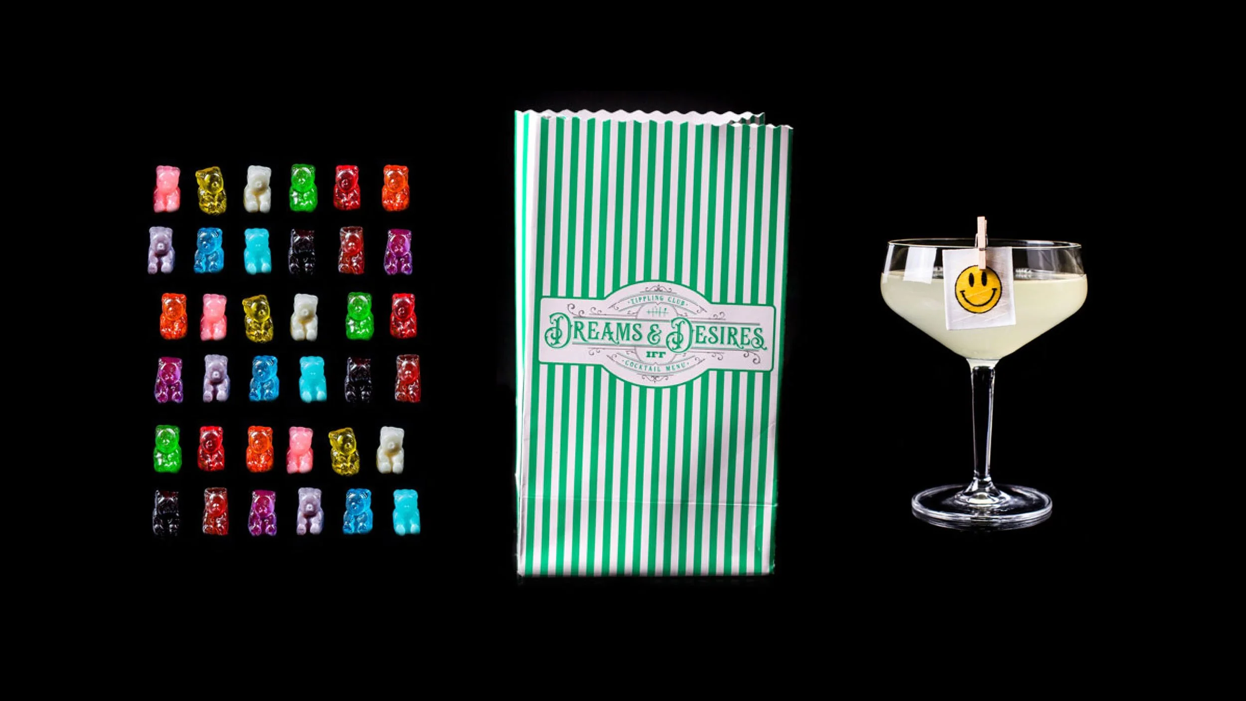
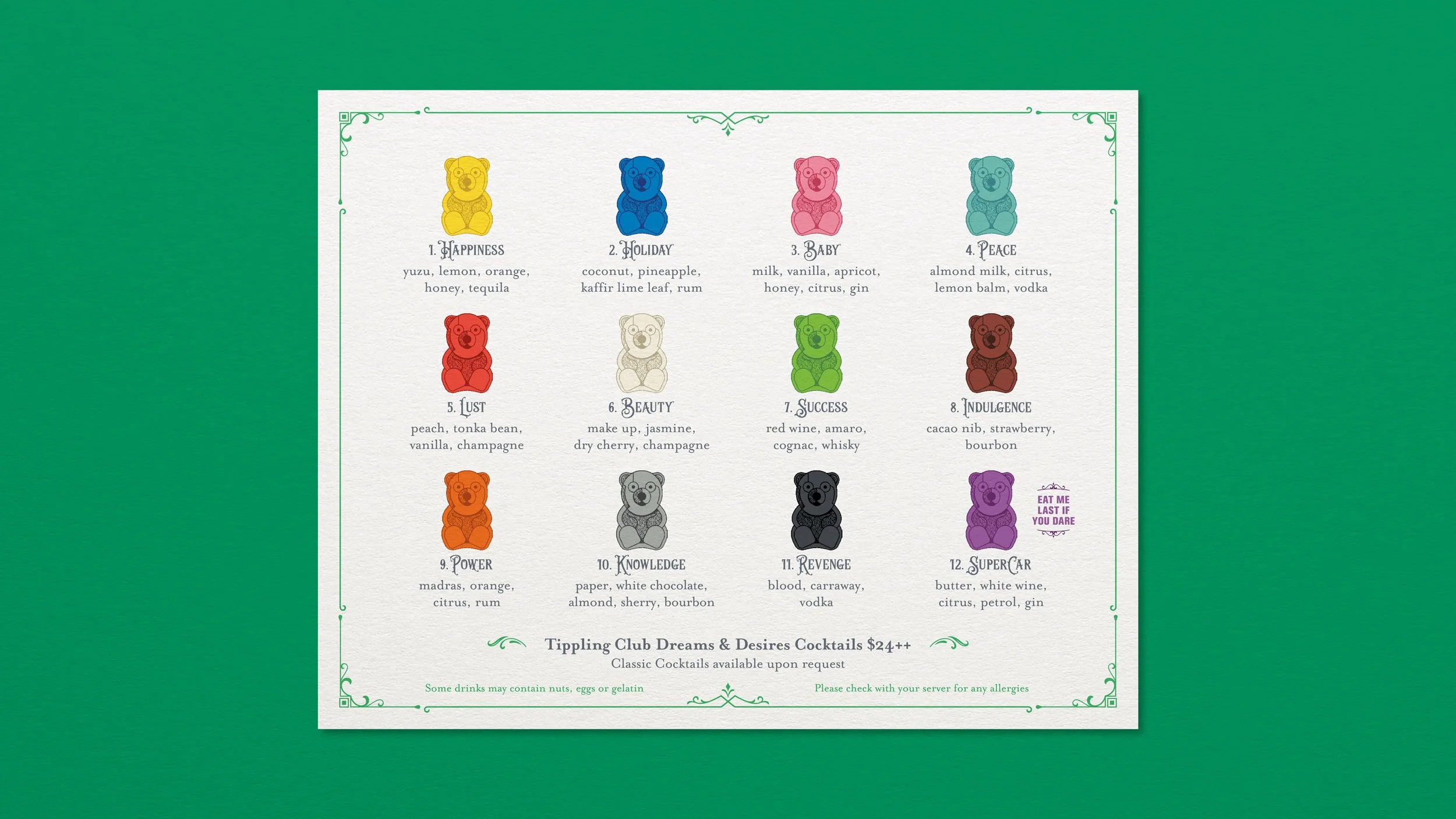
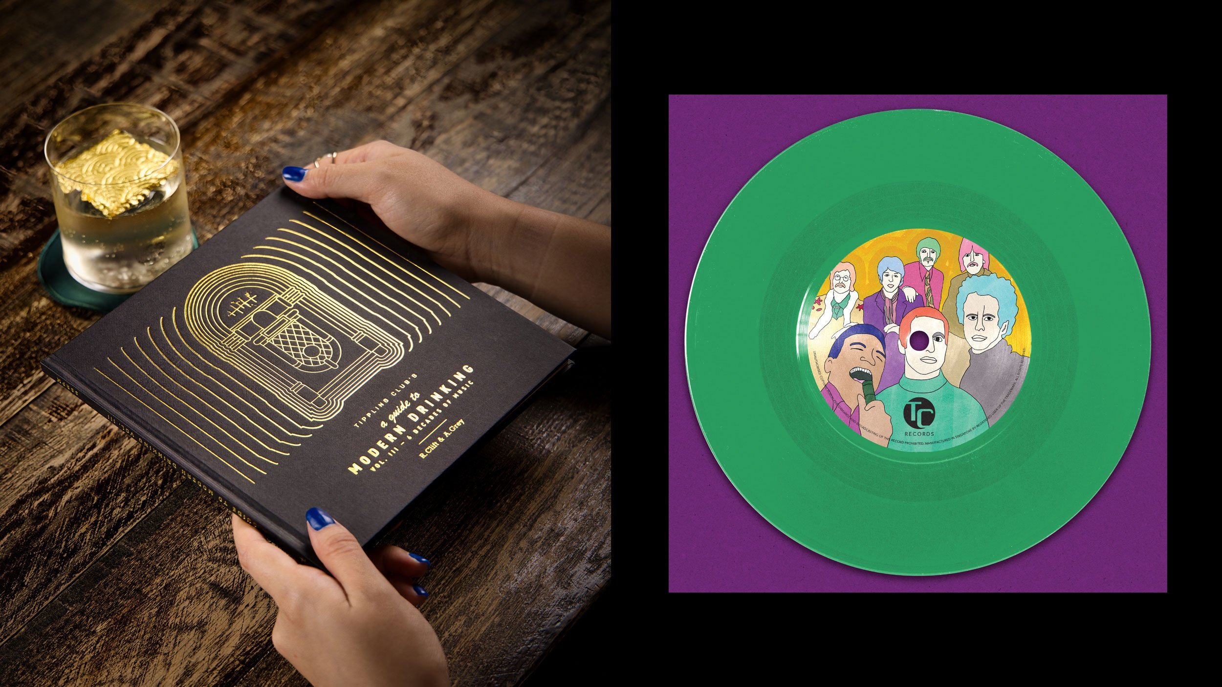
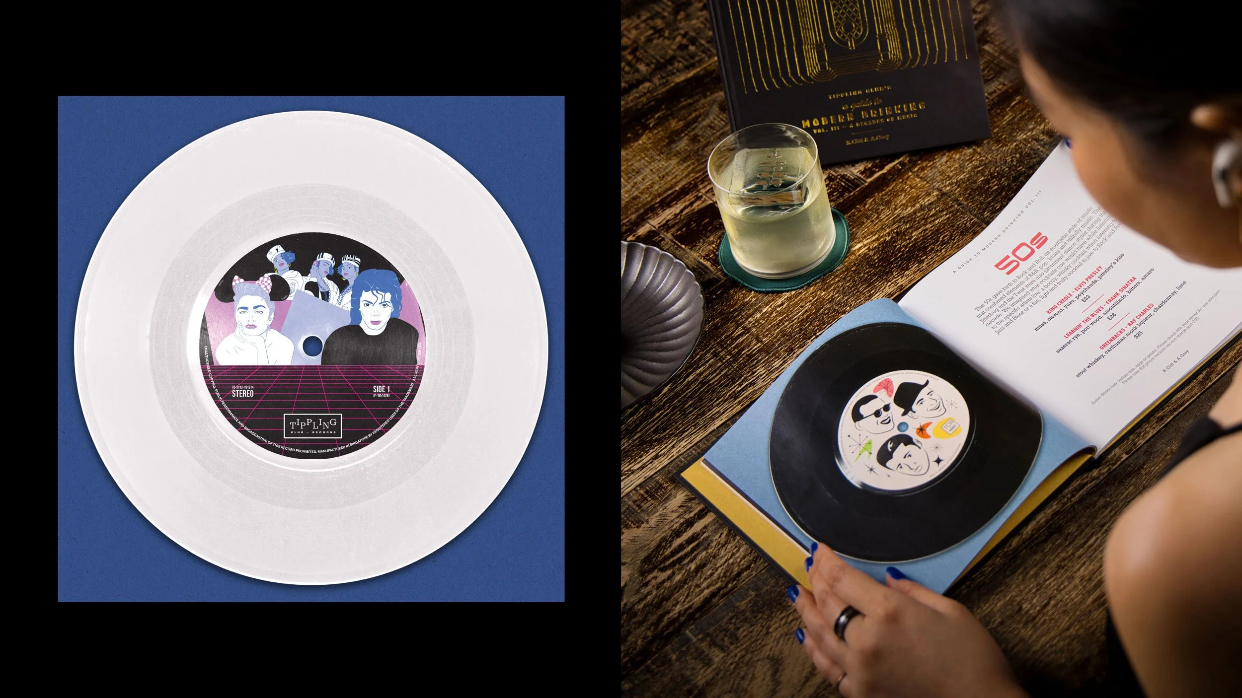
Tippling Club sought to imbue the dining experience with a sense of excitement and a touch of theatre, and our custom packaging and cocktail menu designs over the years met this whimsy head-on, adding to the overall experience.

The logo for Tippling Club in silver on a dark green background. Hand drawn lowercase letters drawn with ink spell out Tippling Club above and below a fishbone shape surrounded by ink splats.
Exterior of Tippling Club in Tanjong Pagar, Singapore showing an illuminated laser cut Tippling Club fishbone logo sitting above the double door entry.
Black embroidered Tippling Club fishbone logo on a folded white napkin sits on a bar top (left) and Chef Ryan Clift plating up dishes in the Tippling Club kitchen. The Tippling Club logo is embroidered in black on his white chefs apron (right).
Black plate in the shape of an ink splat is engraved with the Tippling Club fishbone logo in white. One lolly in clear wrapping sits on top.
Black hand drawn type displays the text ’new culinary insights, cooking techniques & perfect pairings’. The text is surrounded by ink splats on a light grey background.
Tippling Club menus in light grey and orange sit upright on a bar top at Tippling Club in Dempsey Hill, Singapore (left) and a close-up of an orange buckram Tippling Club menu bearing their logo embossed in black on the front (right).
Quad image showing two images of dishes by Chef Ryan Clift as well as two cocktails.
Open spread of the Tippling Club ‘classic’ degustation menu with black text and ink splats on light grey paper. A large hand drawn fishbone spans both pages serving as a visual structure used to show food and drink pairings.
Label design for Tippling Club’s white wine showing the words “Pour Mon Amour” screen printed onto the bottle in a hand drawn ink style (left) and packaging design for a cocktail “Purple Drank” which imitates a cough syrup bottle and box (right).
Packaging design for a Tippling Club dessert to look like a cereal box complete with “Tippling Club Special T Original printed in red and blue.
Packaging design for a palette cleanser in small pharmacy bottles. On the label are details including “Cheesecake 5mg” and “Take one table by mouth until all taken”. A small pile of pink and blue “pills” sits in front of the three bottles.
Sensorium menu: triggering memories through aroma, circa 2016. This cocktail menu takes the form of black perfume test strips with the cocktail name foiled in silver on each one, presented fanned out on a silver cocktail strainer.
Six by six grid of colourful gummy bears (left), green and white striped paper sweets bag with “Tippling Club IFF Dreams & Desires Cocktail Menu” on the front (centre) and cocktail with a smily face edible sticker pegged to the front (right).
Mockup of Tippling Club “Dreams & Desires” menu on a green background showing a 3x4 grid of colourful illustrated gummy bears with a cocktail name and list of ingredients under each one.
Hands holding “Tippling Club’s A Guide to Modern Drinking Vol. III – 6 Decades of Music” Menu. The menu is square format with a gold foil line illustration of a jukebox on the cover (left) and record label illustration on a green vinyl (right).
Record label illustrating the 80’s decade on a white vinyl (left) and rear view of a person flipping through cocktail menu. The menu is open to the 50s spread where we can see a list of cocktails and an accompanying record illustration (right).
Arathorn Grey seated holding Tippling Club’s “First Time for Everything” cocktail menu. White hand drawn sharpie text on a black menu in the style of a journal.
Mockup of Tippling Club’s “First Time For Everything” cocktail menu using the Tippling Club ink style to create diary entries for ‘Season 1’ and associated four cocktails (left) and “First F**K” cocktail (right).
Mockup of Tippling Club’s “First Time For Everything” cocktail menu using the Tippling Club ink style to create diary entries for ‘Season 2’ and associated four cocktails (left) and “First Party” cocktail (right).
Mockup of Tippling Club’s “First Time For Everything” cocktail menu using the Tippling Club ink style to create diary entries for ‘Season 3’ and associated four cocktails (left) and “First Pet” cocktail (right).
Mockup of Tippling Club’s “First Time For Everything” cocktail menu using the Tippling Club ink style to create diary entries for ‘Season 4’ and associated four cocktails (left) and “First Phone” cocktail (right).

Project Credits

Design, Typography & Illustration:
Drooly Noted

The OG:
Credit to Ray Chang who started on the TC journey with Cam back in ’08

Photography & Video:
Courtesy of Tippling Club

Previous
Previous

Like Minded Creatures 1.0

Next
Next

Schofield's