
Client / Overview
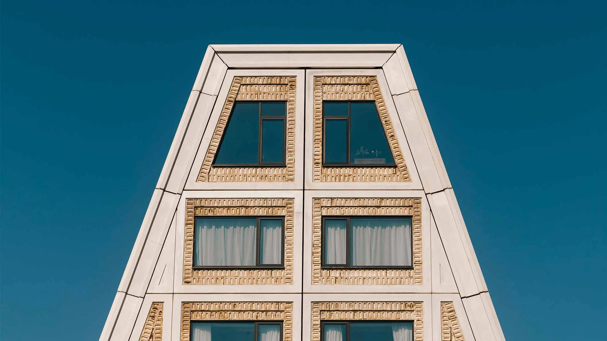
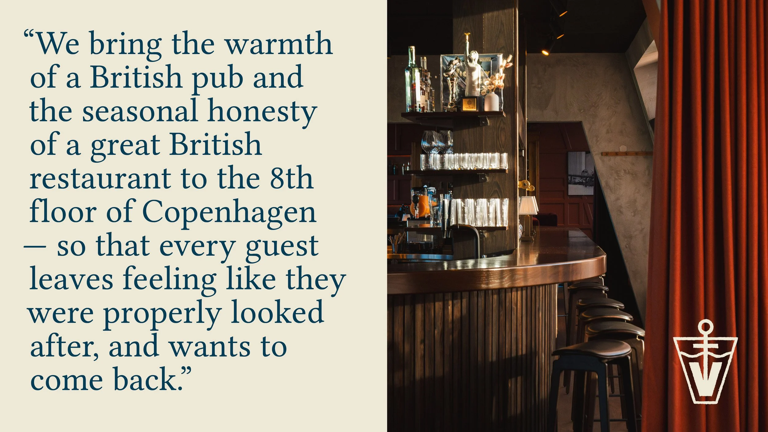
Victory is a modern cocktail bar in Copenhagen specialising in seasonal twists on classic cocktails. Sitting at the top of the 25hours Hotel on Paper Island, our brief was to weave together the bar's British roots with its distinct Danish locale.
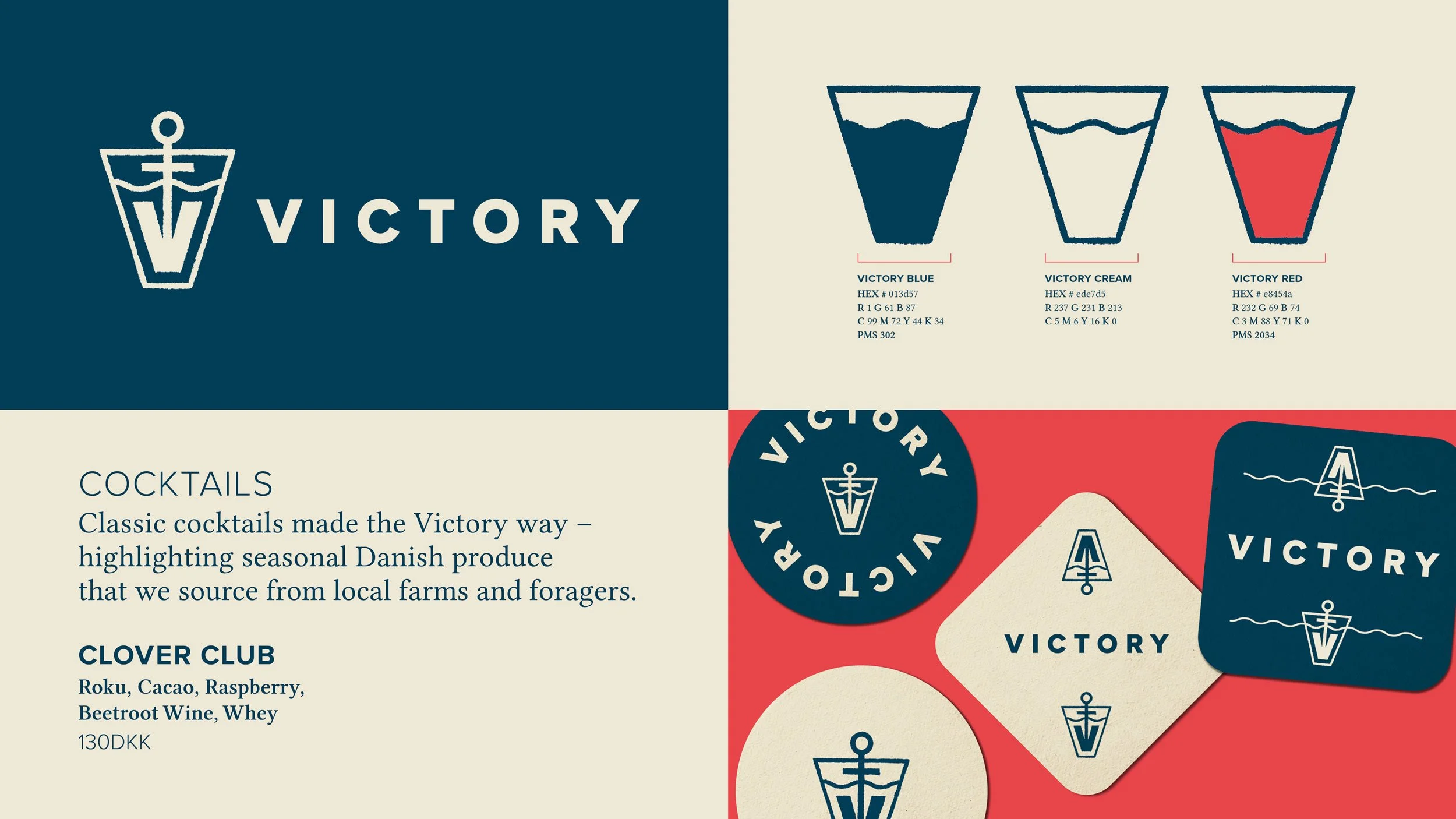
We made small but impactful updates to refresh the brand, starting with creating a new logotype inspired by hand-painted lettering behind the bar. We chose a brighter navy and red, paired with classic typography, to complement the new logo.
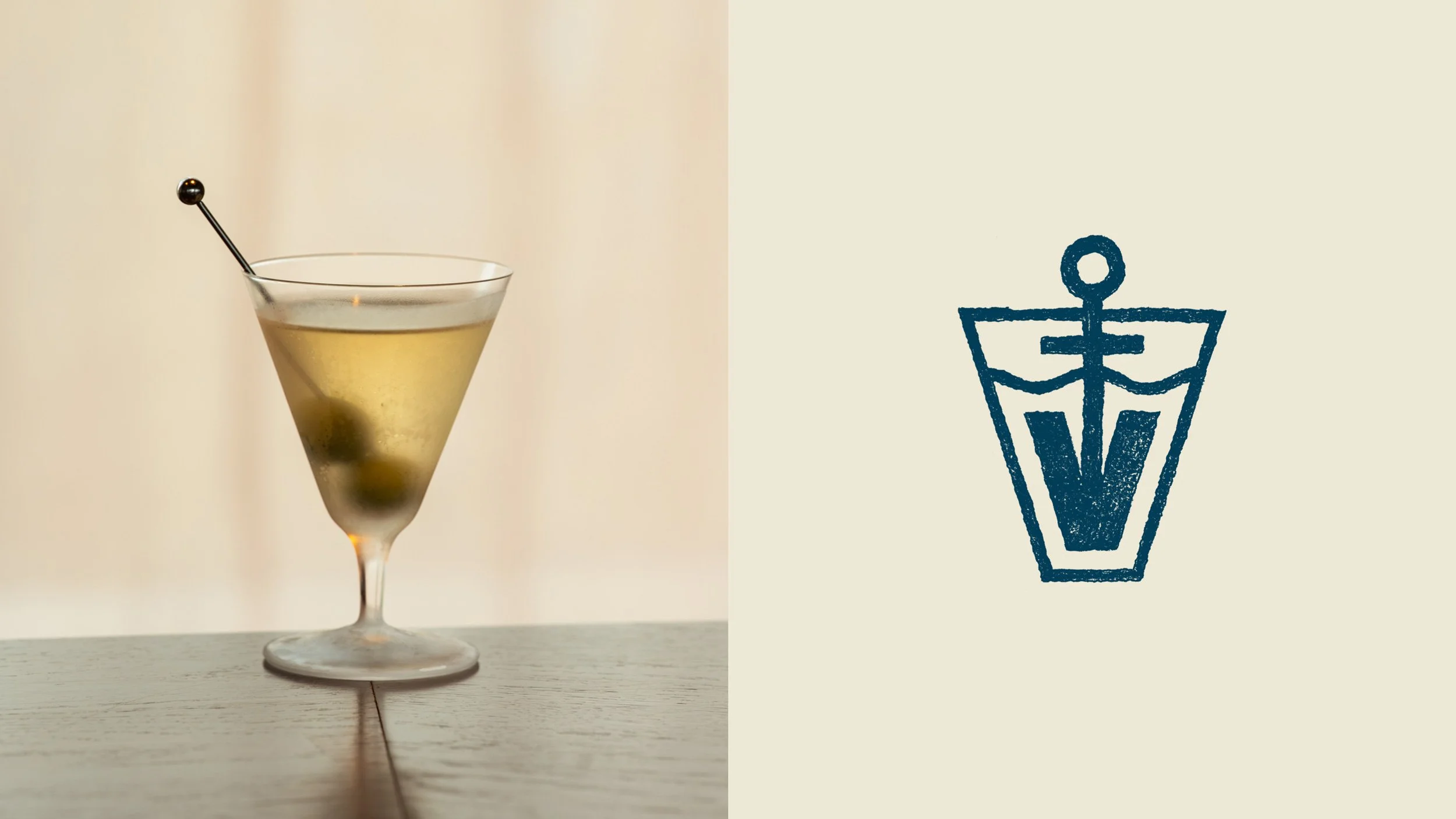
We added a hand-drawn symbol to bring warmth and honesty to the brand. The triangular shape references the top of the building where Victory resides on Paper Island. Inside, a wavy line represents the harbour, with an arrow pointing up to the top, indicating that Victory is on the top floor. When the symbol is flipped, we see a V-shaped anchor in a glass, with the harbour line now indicating the top of the drink. The anchor shape also references a cocktail pick. The symbol's beauty is that it works in either orientation.
Project Credits
Design & Typography:
Drooly Noted
Photography:
Courtesy of Victory